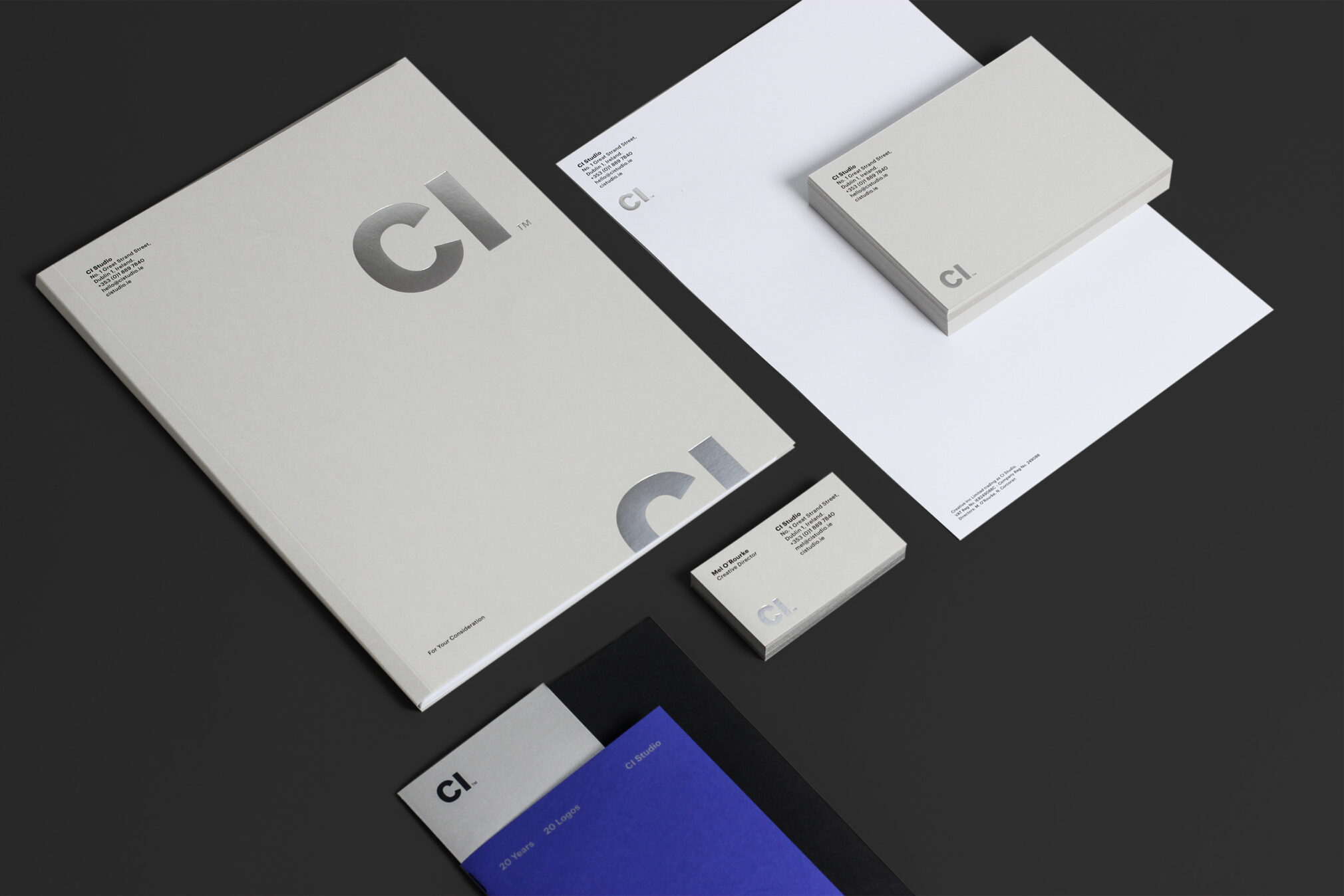
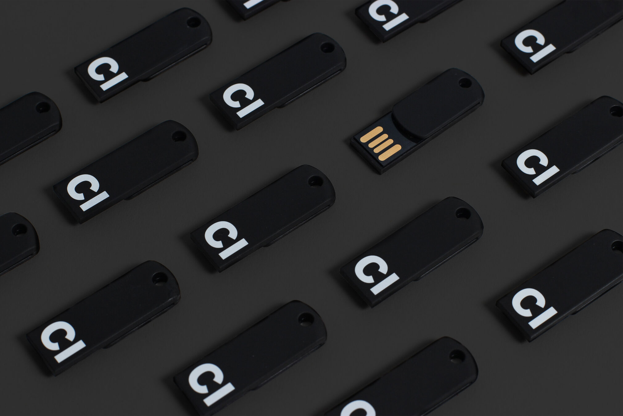
Over the last 6 months we have taken on a number of internal projects including our website, signage, 20 Year Logobook and of course our stationery.
To mark our 20 years in business we recently took stock of our own brand identity and changed our name from Creative Inc to CI Studio.
Regarding our name, for years we have been talking about a change. We felt the name Creative Inc was from a different time and had started to naturally progress into an abbreviation. While still connected through the initials, CI Studio feels more appropriate and reflective of the work we do currently and who we are. It was important to translate this change into everything relating to CI Studio.
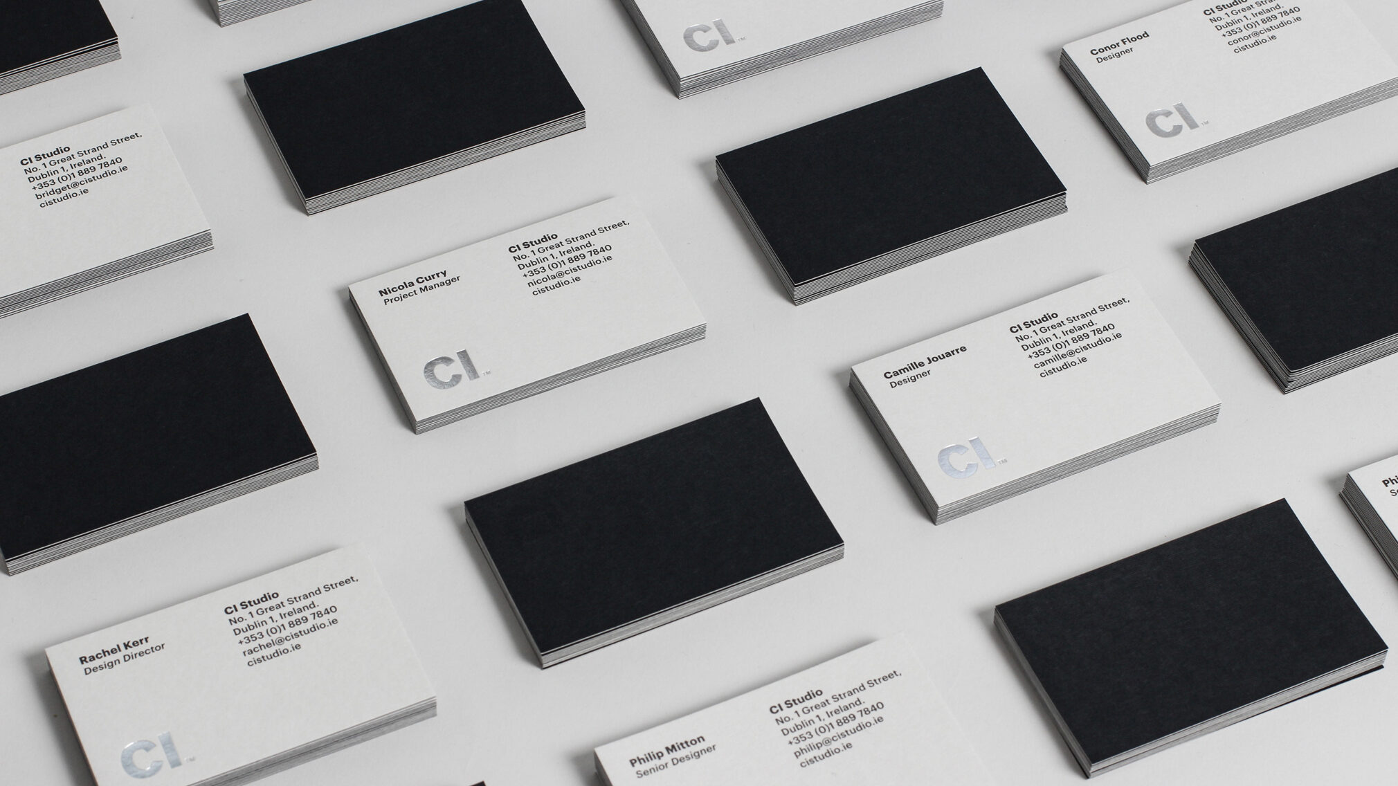
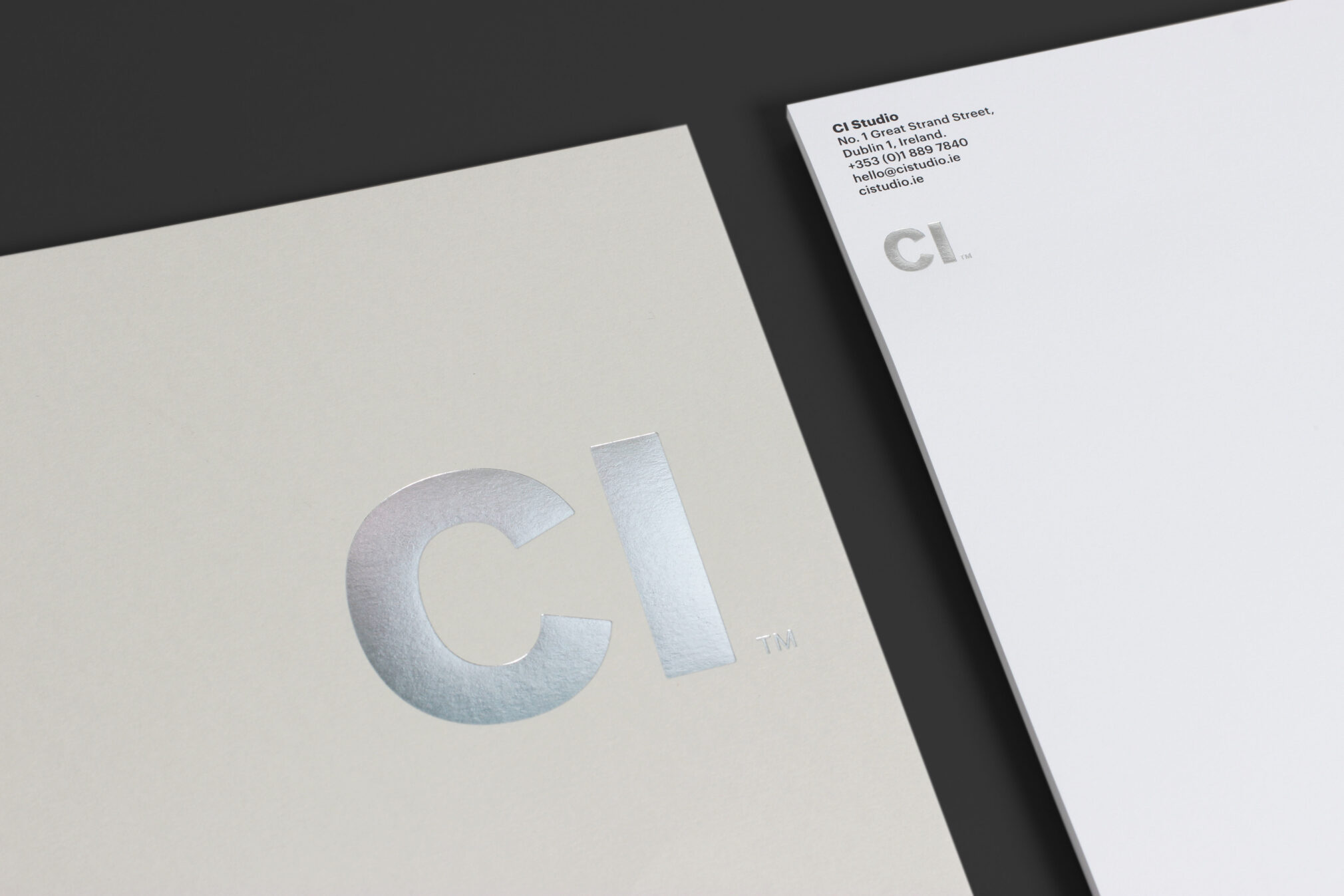
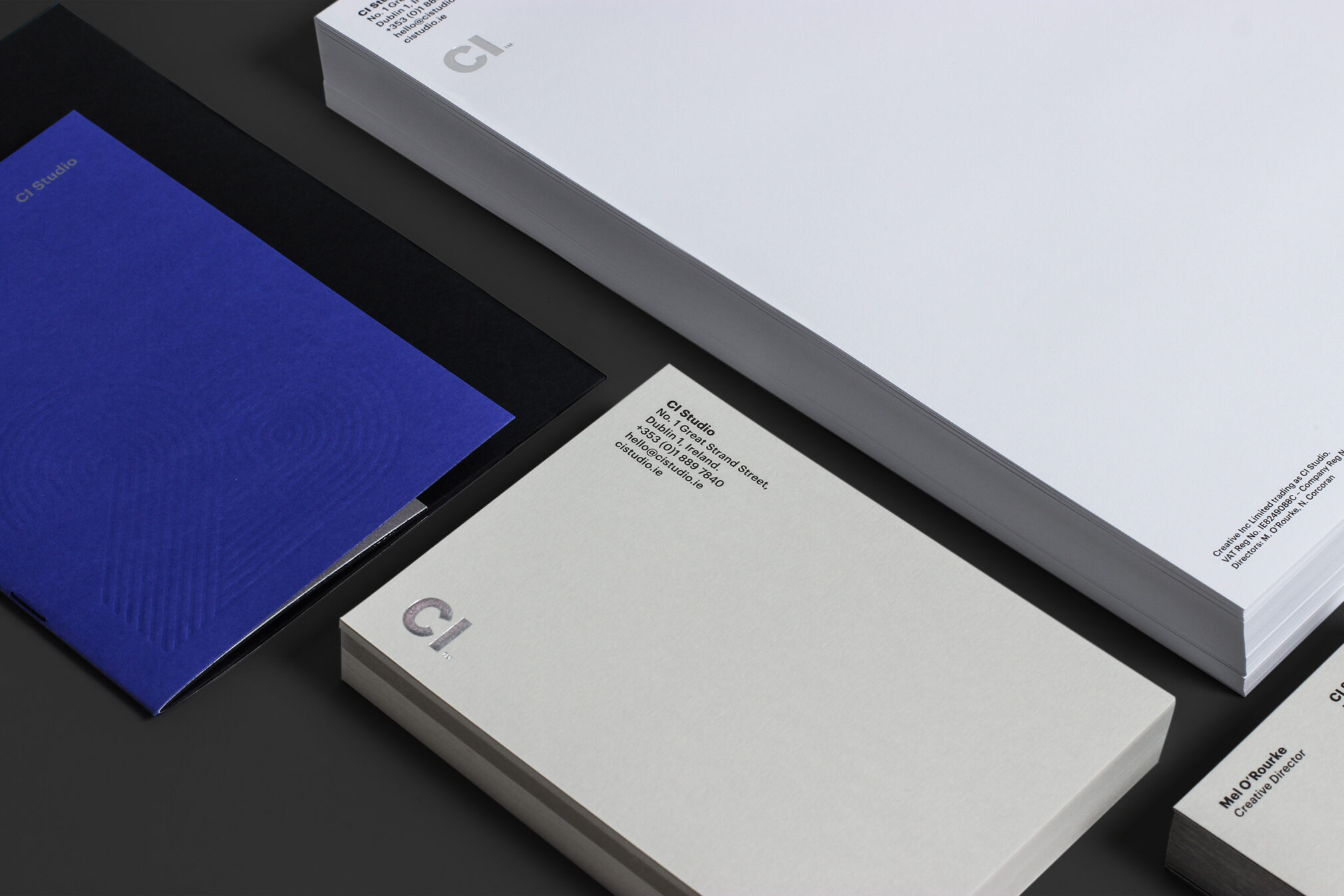
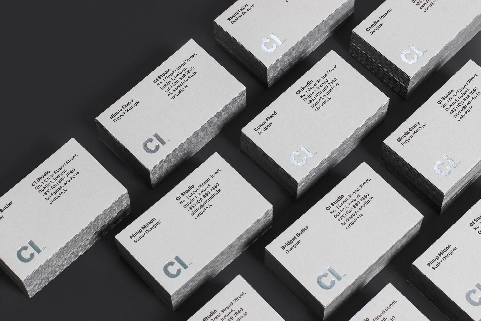
As a design led agency, print is still hugely important to us and for our print materials, we used minimal black typography on a mix of Colorplan White Frost and Pale Grey. Our business cards are duplexed Colorplan Pale Grey and Black with a wire emboss.
To introduce a tactile element in contrast to the minimal typography and colours, and as a finishing touch we used a platinum foil, signifying our 20th Anniversary.
Rachel Kerr, Design Director
To view more of our work and get a sense of who we are and what we do, please take a look through our website or contact us at the below details.


