OOST
Taking fitness further
Food & Beverage
Food & Beverage + Retail
Food & Beverage + Retail
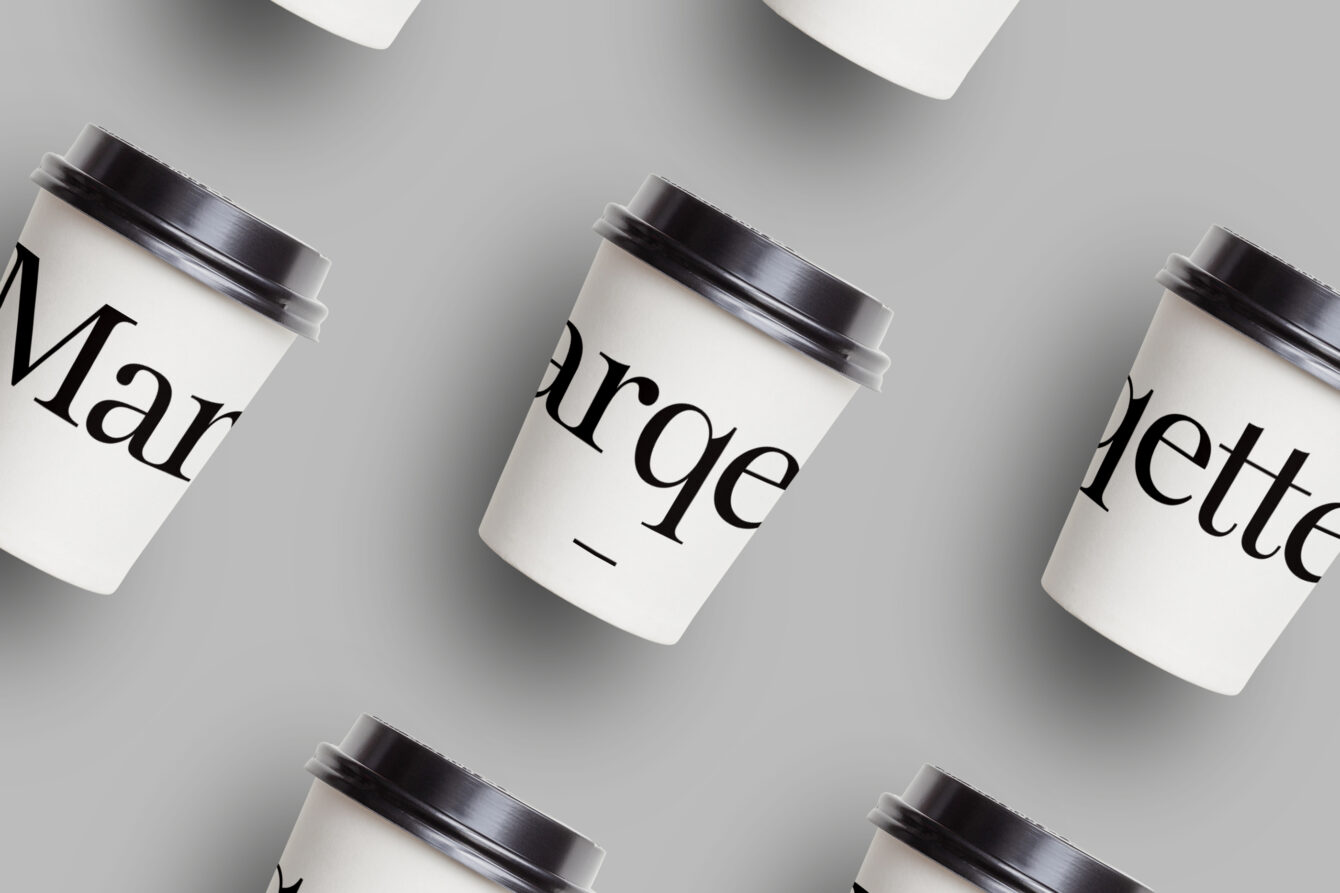
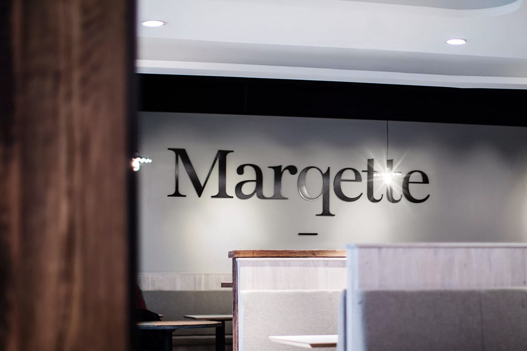
A new food retail concept, conceived for Dublin Airport’s Terminal 1. CI Studio was tasked with creating the new brand identity, naming in turn led to brand creation and activation, bringing a whole new food experience to millions of air travellers. Bringing an outdoor food market into the airport, using the best local artisan suppliers and offering the travelling customer a range of market style fresh food, was our original concept. The name Marqette simply captures the brand sentiment and market nature of the offering.
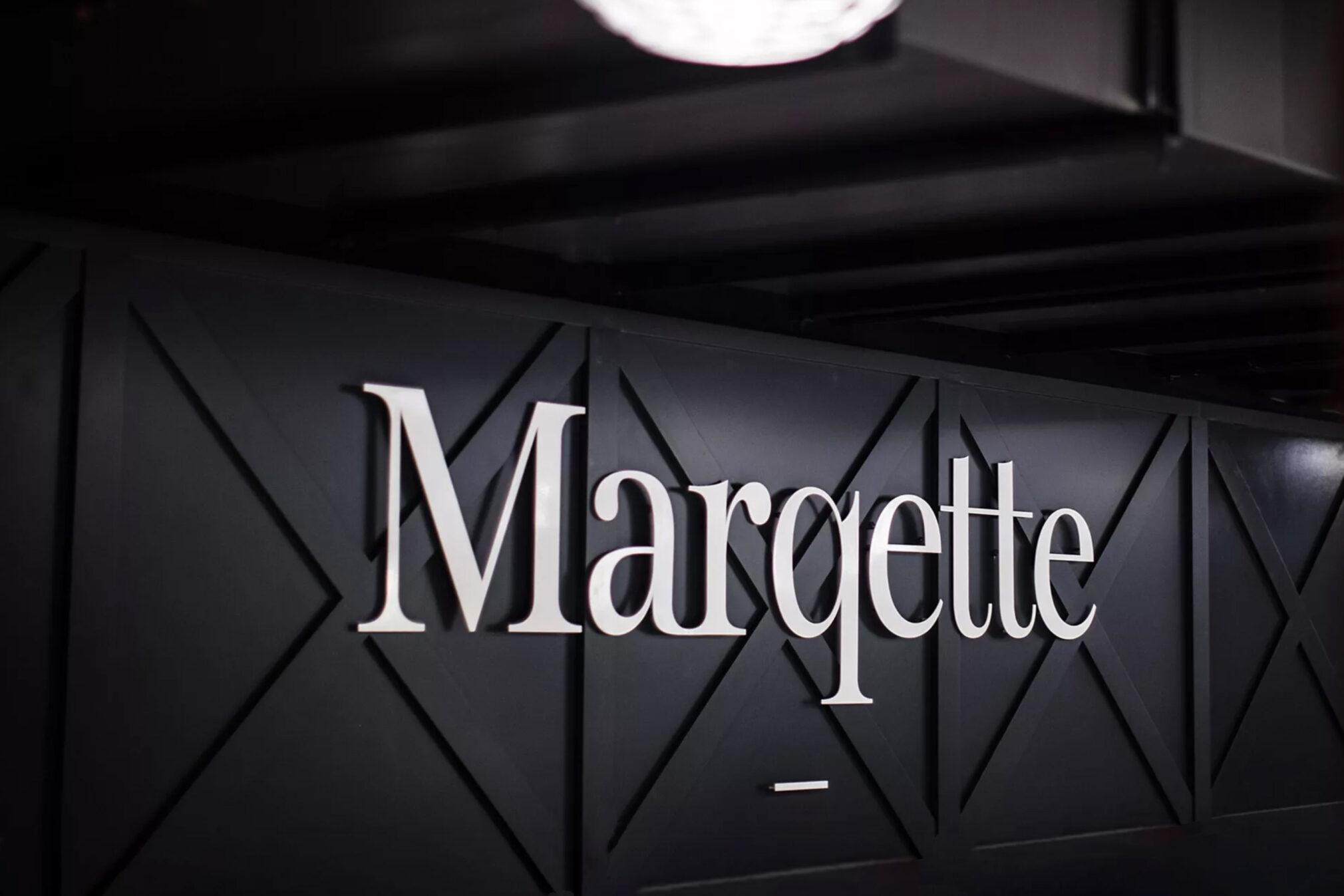
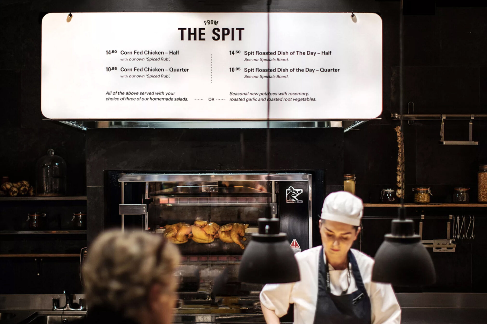
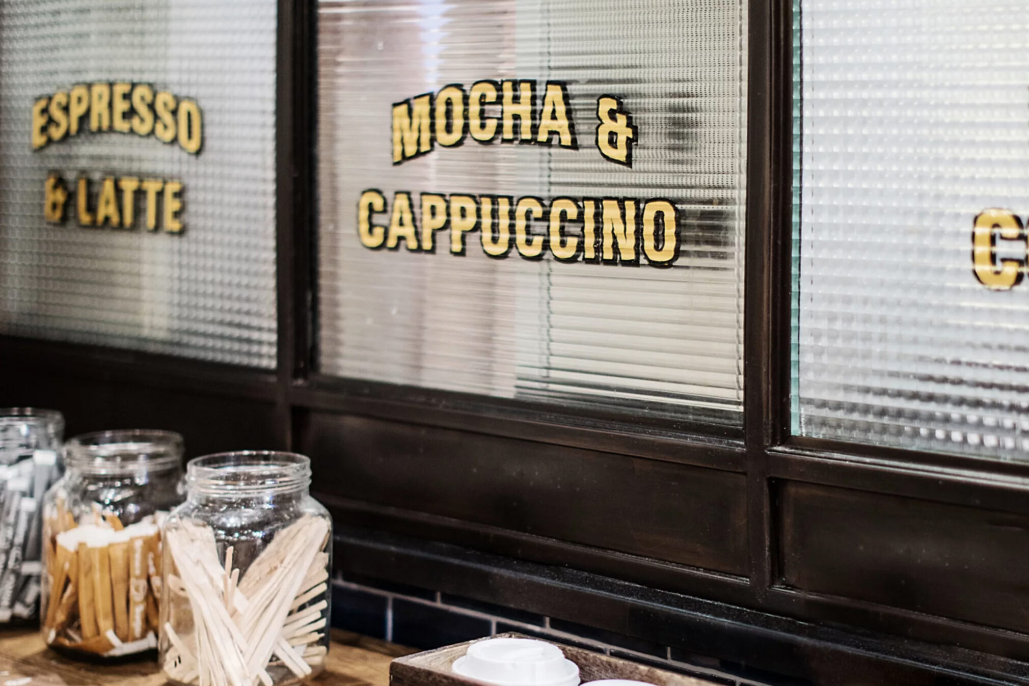
A marque was created to support the main logotype, a mix of airport hangar and Victorian greenhouse, embodying the market garden industry located close to Dublin airport, some of which supply Marqette with their fresh produce. Signage evokes the eclectic nature of indoor markets, from industrial transport graphics to hand-painted typography.
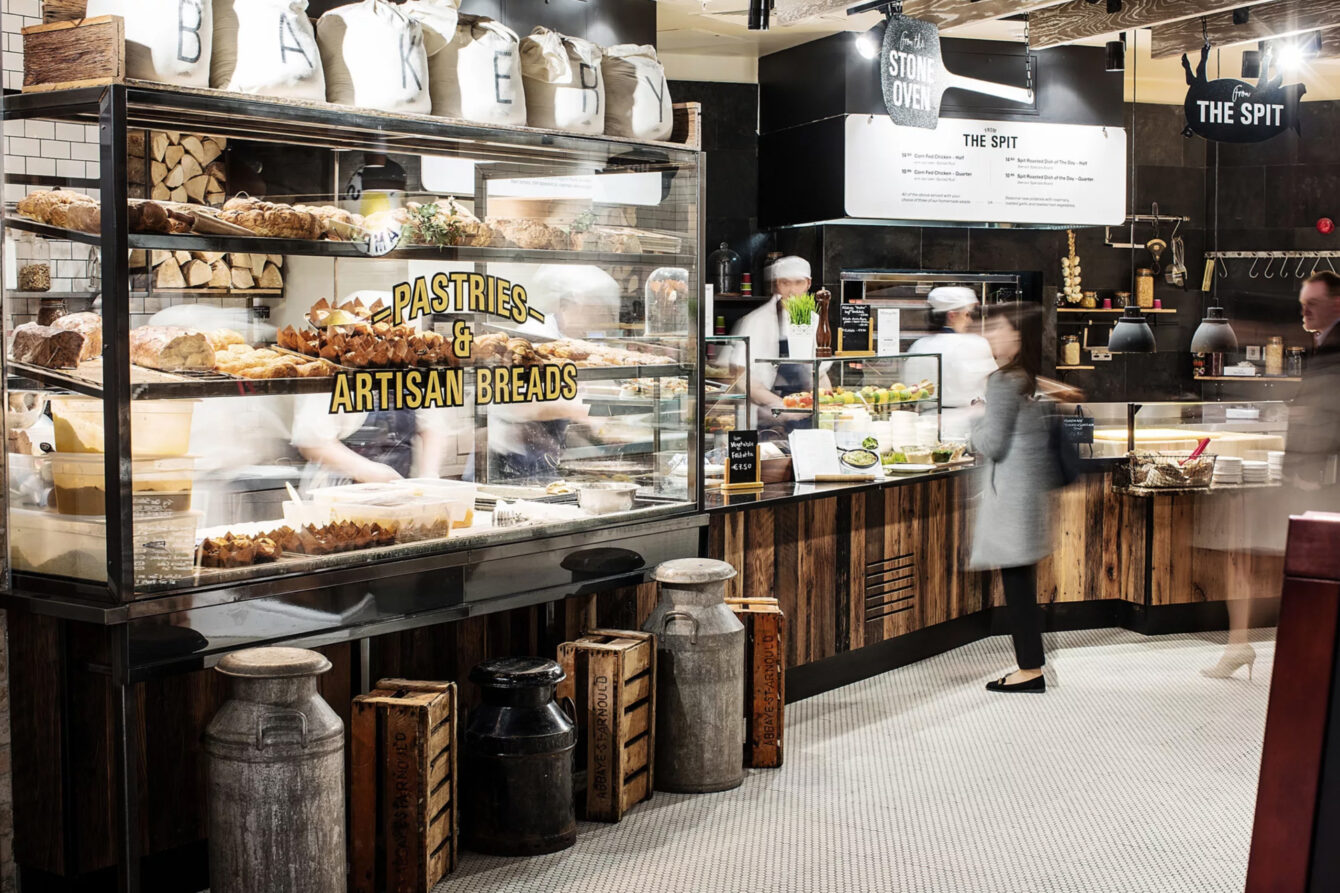
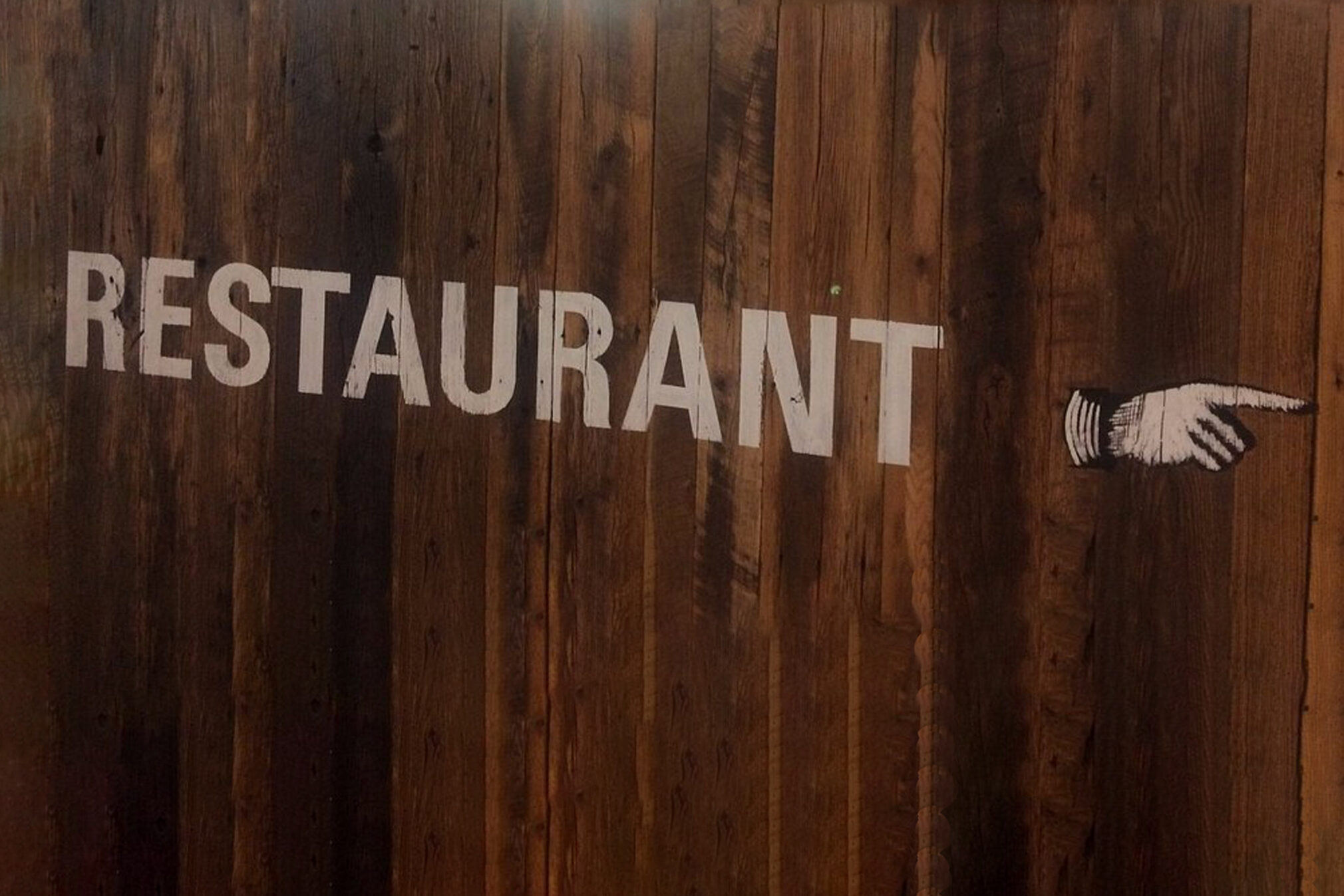
For non-English speakers, key food offerings were denoted by descriptive signs similar to those found outside traditional food and drink traders from pre-literacy eras. Way-finding needed to be highly legible to be viewed from a distance.
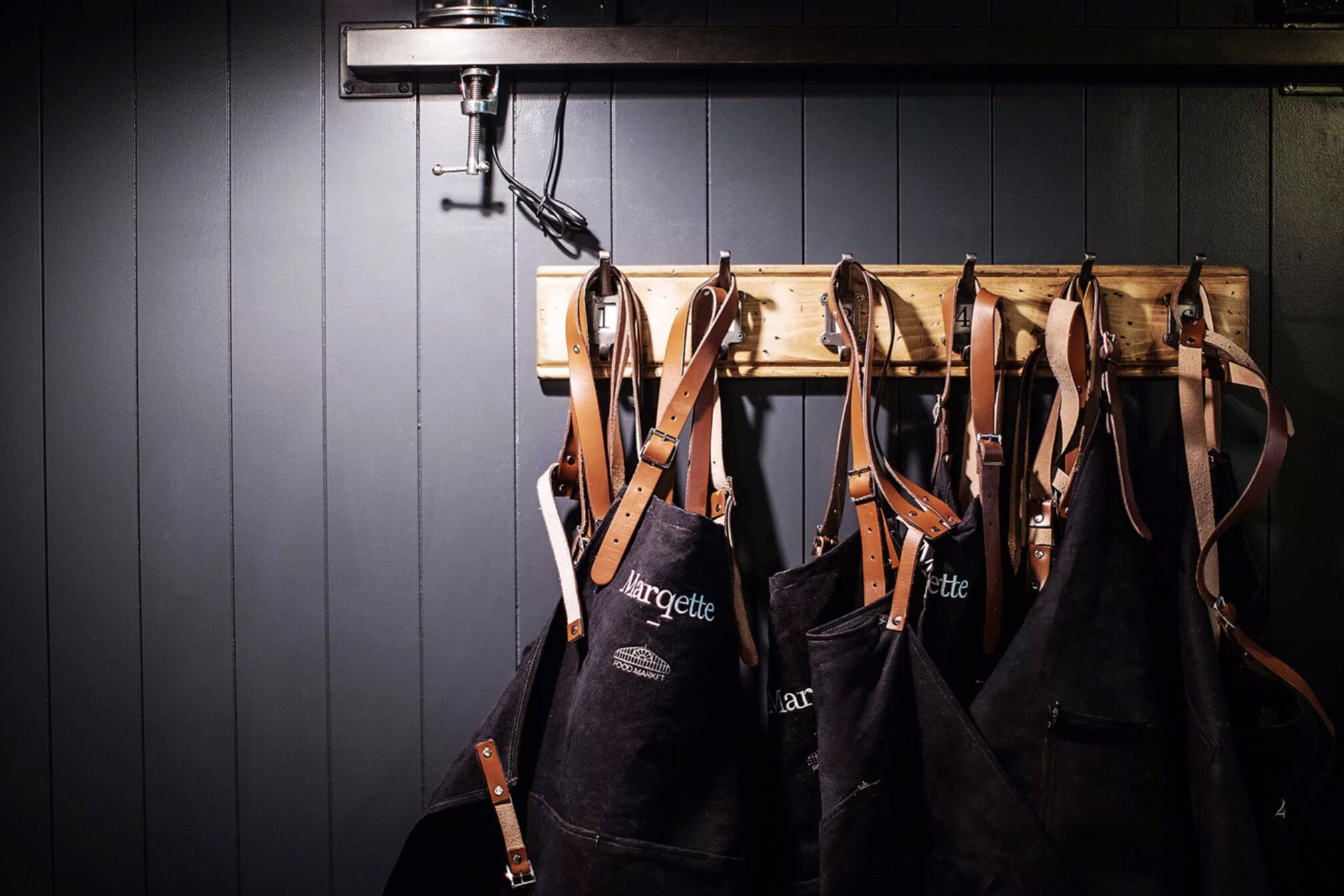
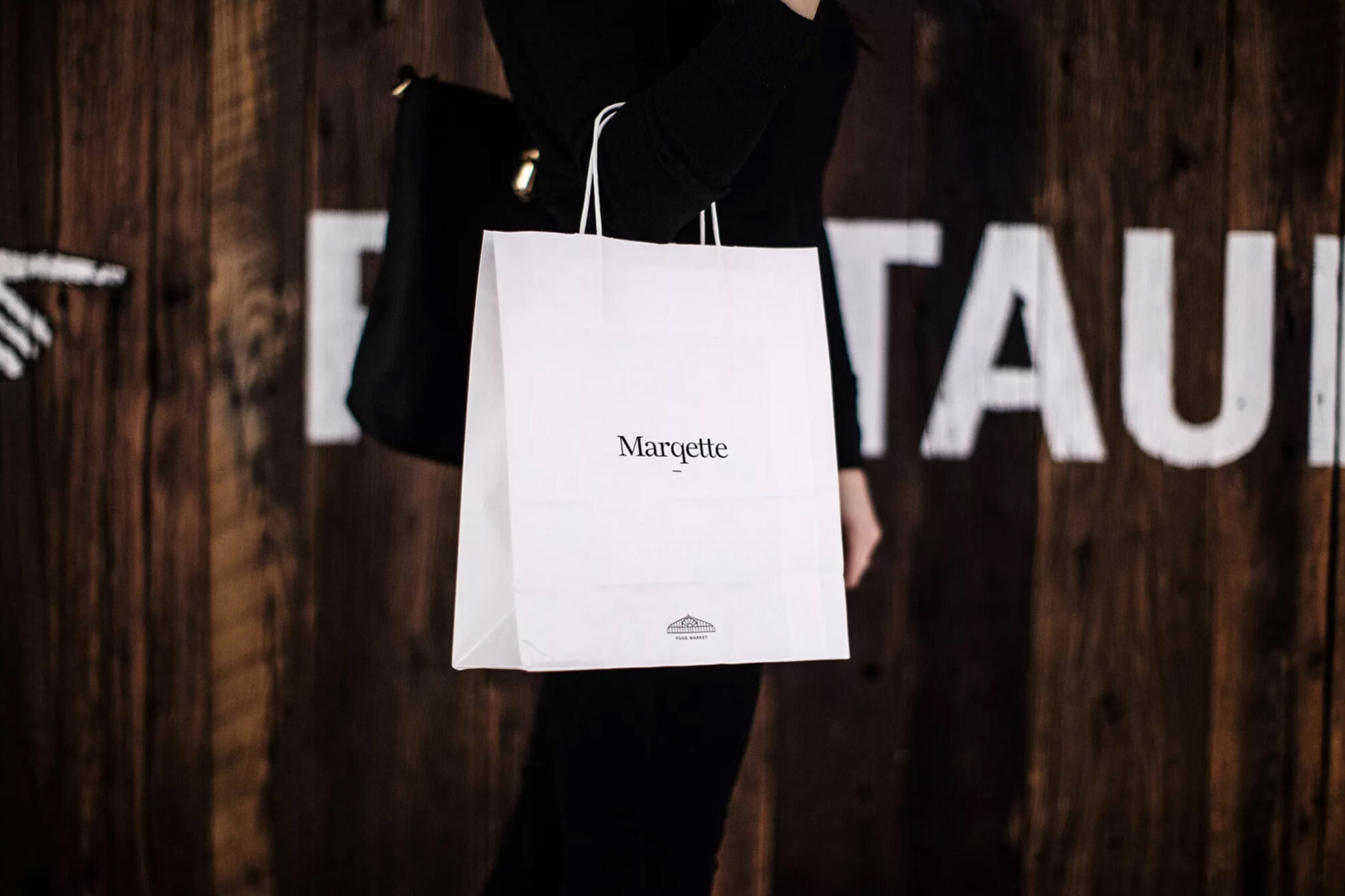
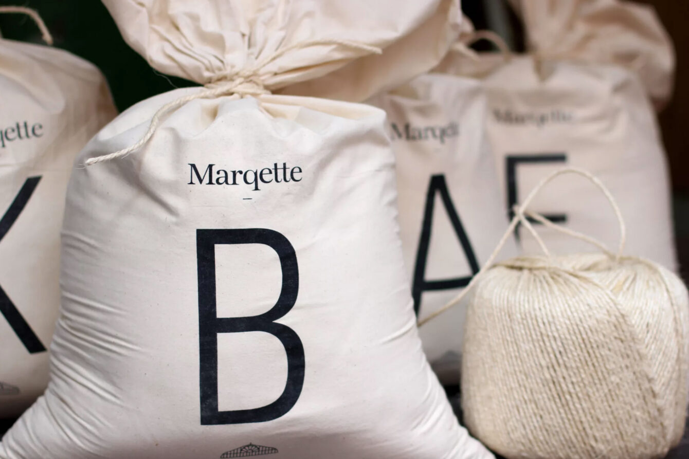
The busy, bustling space with its different food and beverage areas, resulted in the creation of a minimal, pared-back identity synonymous with quality and excellence. Colours were kept natural and monochromatic with packaging working to a simple palette of black, white and kraft brown.
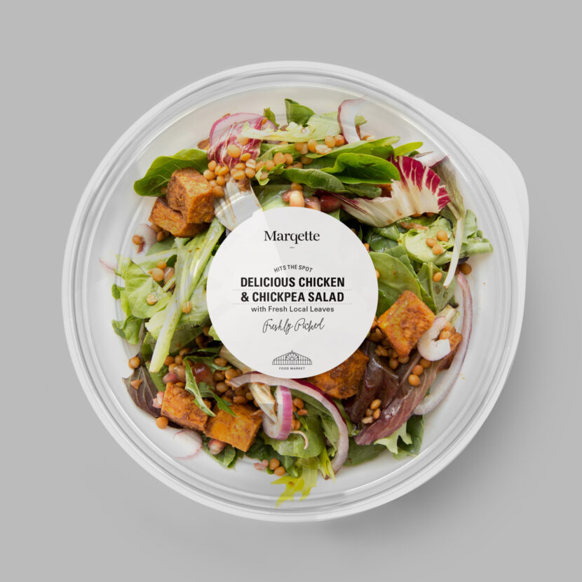
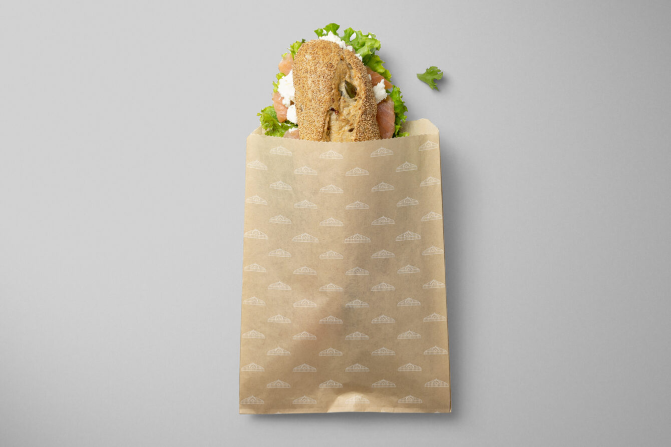
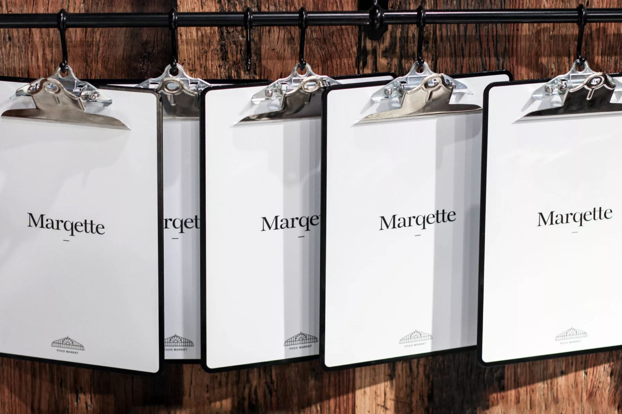
A complete packaging system was devised and kept to the minimal palette, which places the emphasis on the food. A handwritten typeface was introduced and is used for packaging labelling. This is a nod to the informal signs seen in food markets and helps convey its freshness. This complements the other typefaces and also extends beyond the packaging to signage throughout the space.
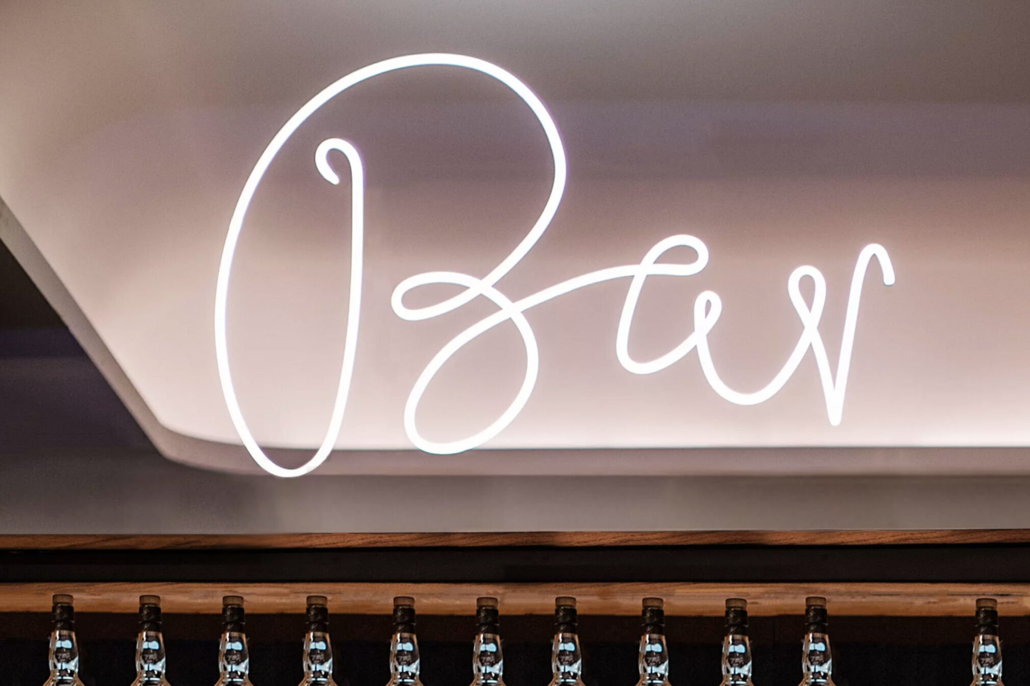
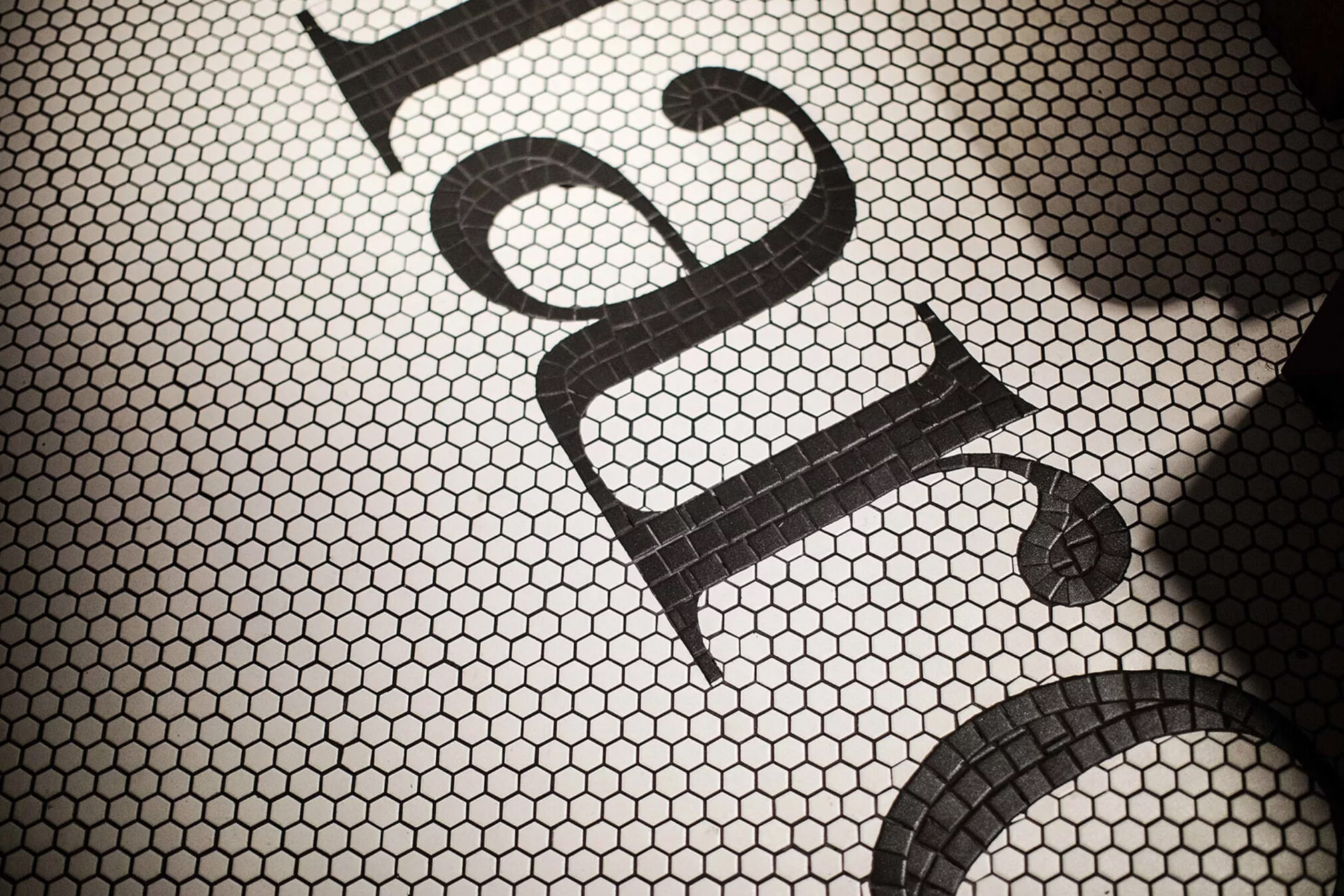
Inspiration for signage was also taken from indoor food markets, such as the integration of the Marqette logotype within the mosaic floor tiles, which also tackled the issue of a lack of a traditional threshold. Typography within signage or branding is expressed in numerous ways, from stencil onto cargo containers, hand-painted, right through to the use of neon. Marqette offers customers an engaging and memorable airport dining experience.
Taking fitness further
Food & Beverage
A big brand for a small local fishmongers
Retail
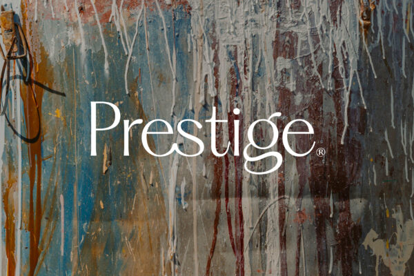
Finest Irish paint reimagined
Retail
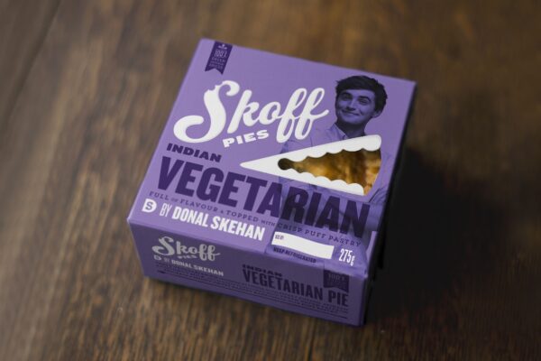
Pies of flavour from Donal Skehan
Food & Beverage + Retail
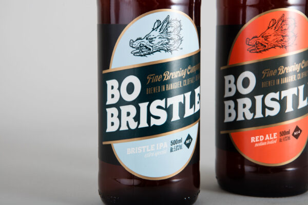
Craft beer brand of character
Food & Beverage + Retail
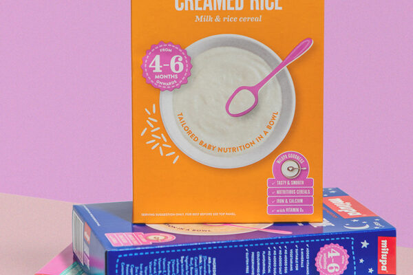
Baby nutrition in a bowl
Food & Beverage