Fitzsimons
A big brand for a small local fishmongers
Retail
Fashion & Beauty + Retail
Fashion & Beauty + Retail
Established in 1916, John Brereton Jewellers wanted to update their brand identity. Specialists in selecting and supplying exclusive diamond jewellery sourced from around the globe, the challenge was to establish a sense of heritage to the brand while differentiating them from competitors on the high street.
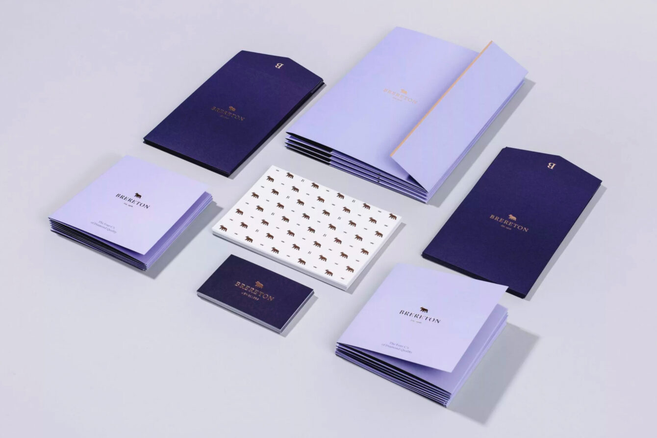
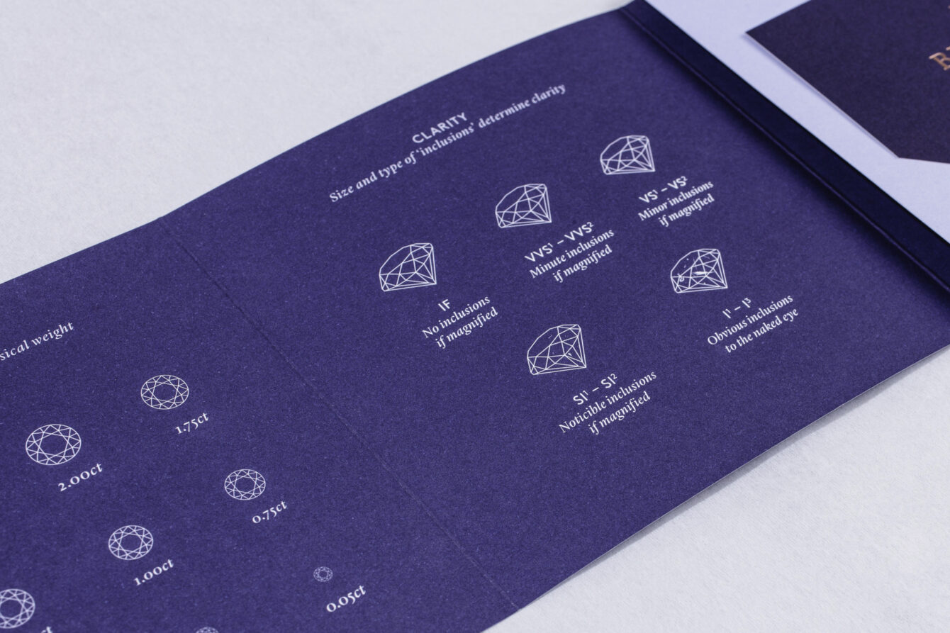
The new brand identity needed to convey their specialism in selecting and supplying exclusive diamond jewellery and their long-standing association with craftsmanship. We dropped the ‘John’ from the name to reflect the family business as it stands today.
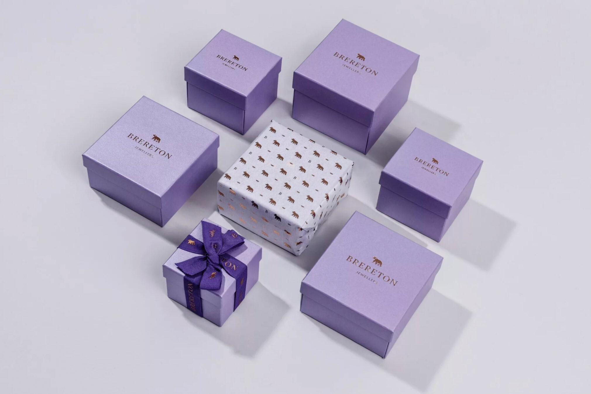
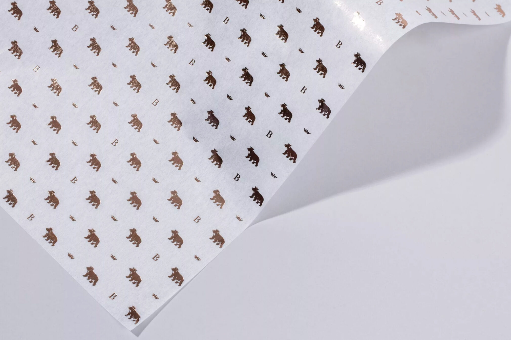
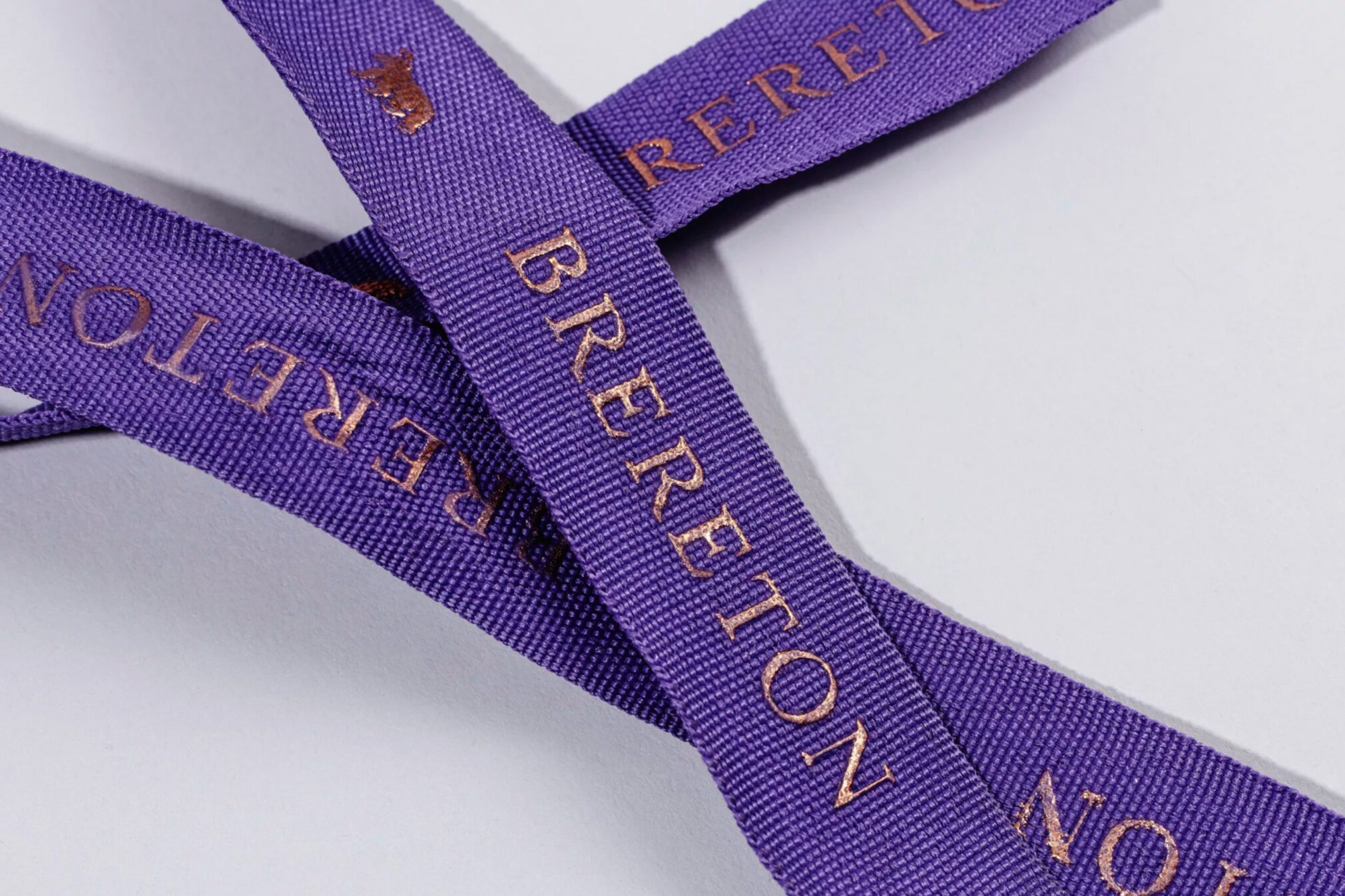
To evolve the identity and have it rooted in their heritage, we explored the Brereton family crest. Contained within the crest is a bear’s head in a ducal coronet which we felt could convey a more high-end tone within the identity. We designed a new emblem, redrawing the bear wearing the coronet to work alongside a new logotype. Colour was updated to a more contemporary deep violet, lilac and rose gold for standout, which is classic yet luxurious in tone.
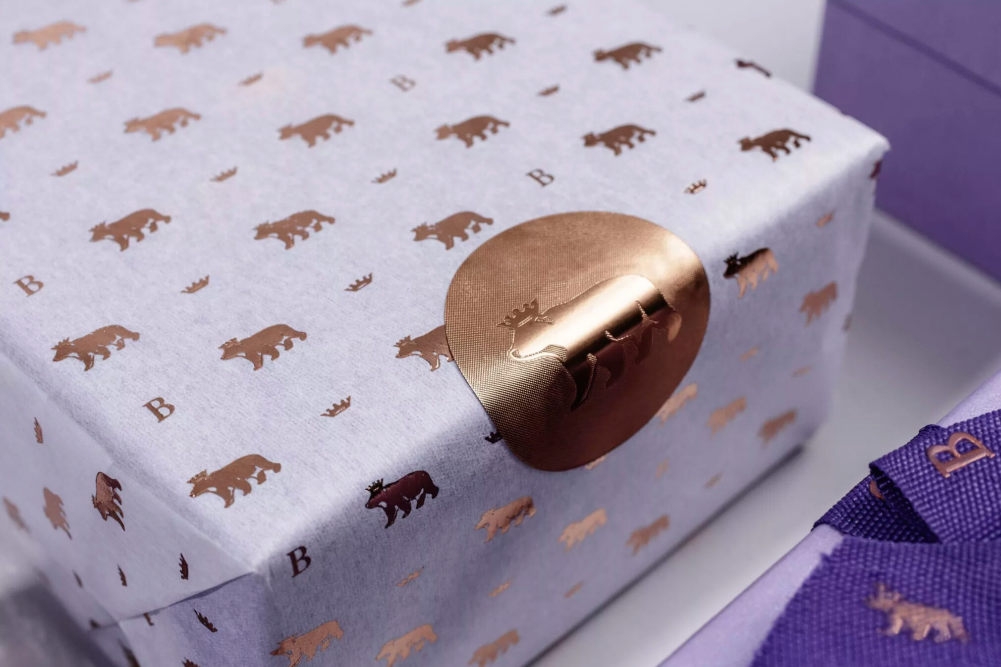
The new identity is applied to all touch points within the stores, packaging, promotional pieces and online.
A big brand for a small local fishmongers
Retail
Boutique Belfast eyewear
Fashion & Beauty + Retail
Hair design studio
Fashion & Beauty
Man Made Hair by Carlin Doran
Fashion & Beauty
Together We Rule
Fashion & Beauty
No hair this way
Fashion & Beauty + Retail