Tusla
Ireland's child & family agency
Public & NGO
Corporate Services + Public & NGO
Corporate Services + Public & NGO
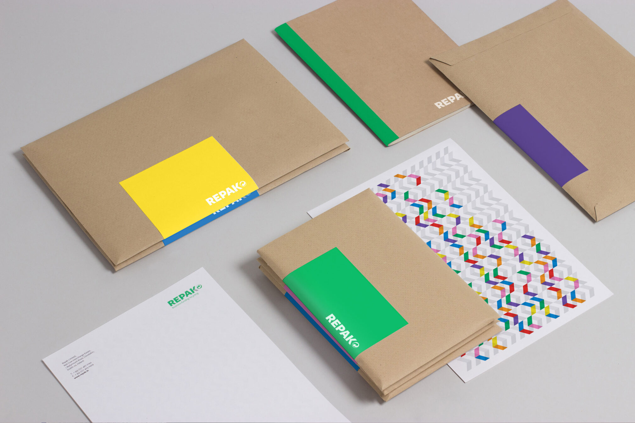
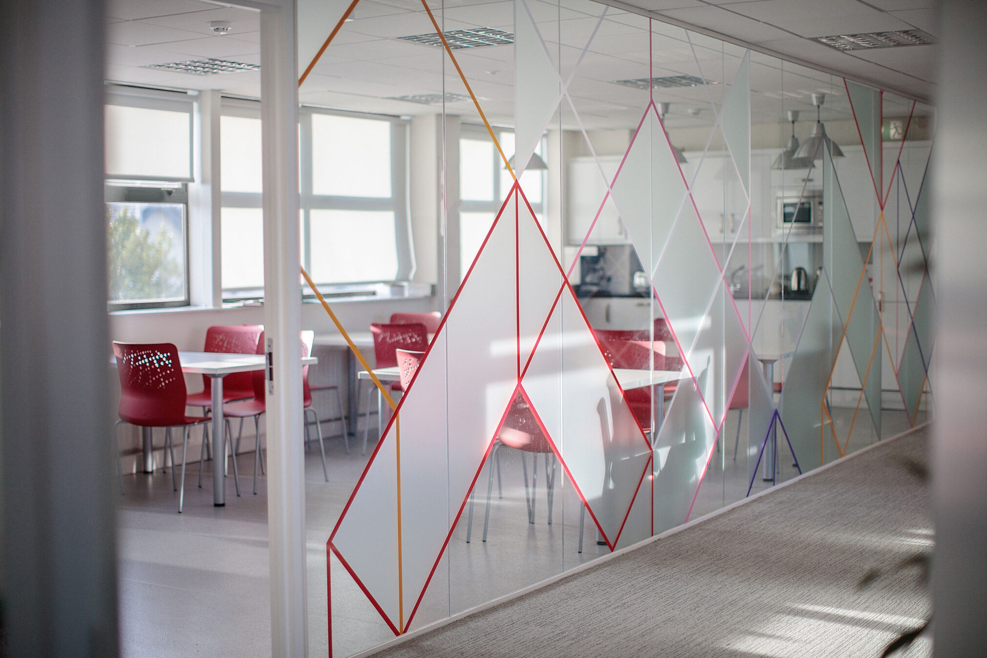
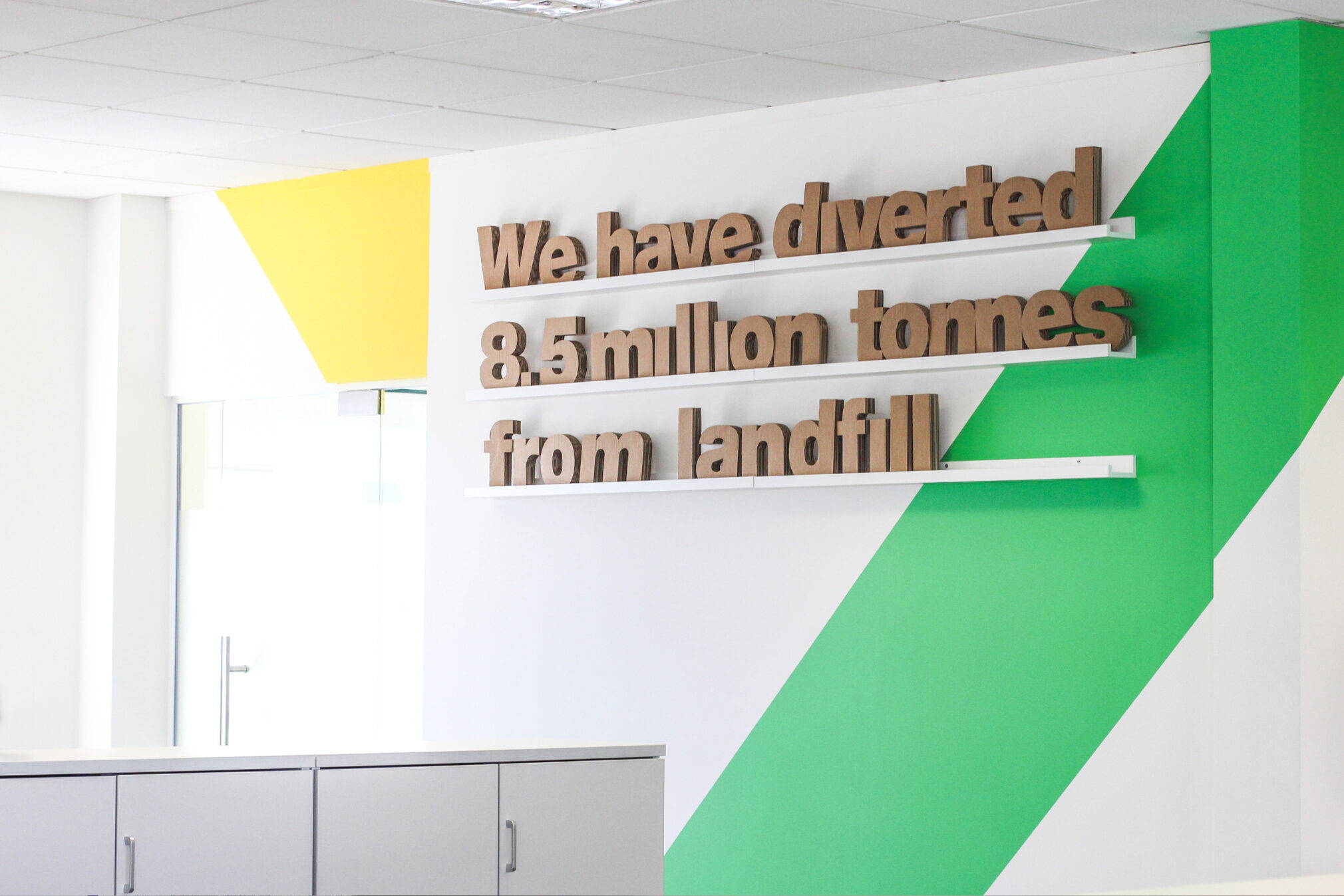
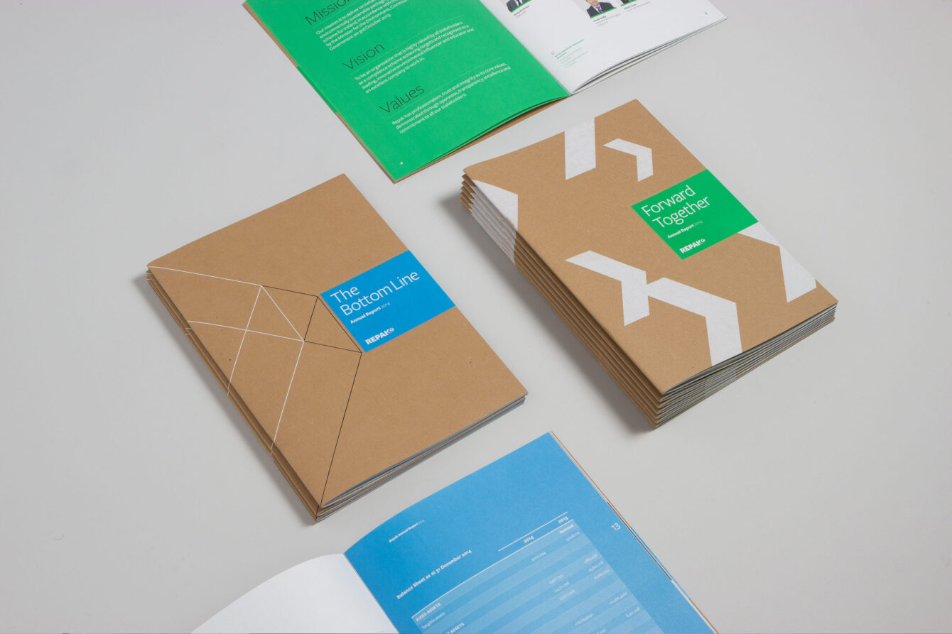
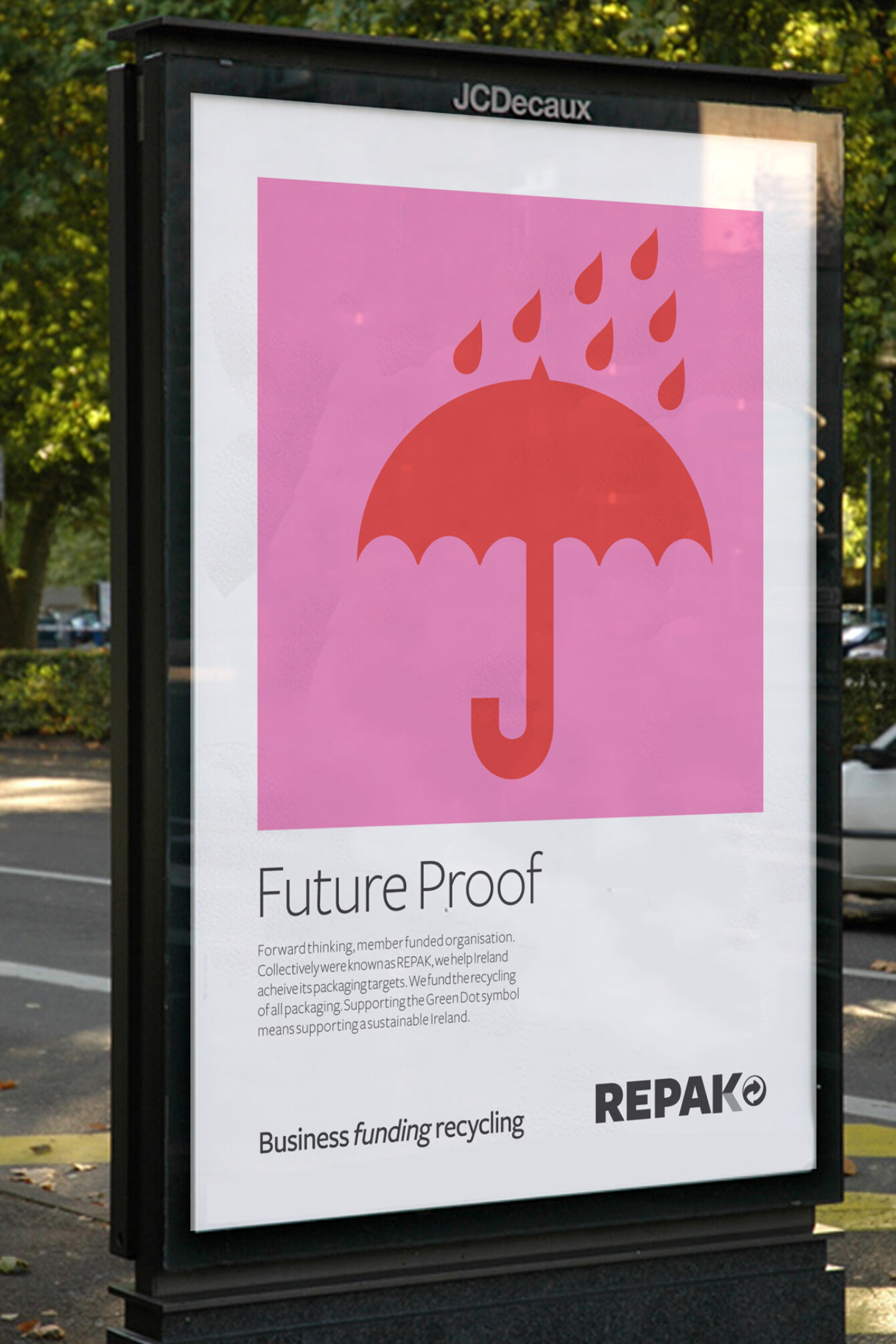
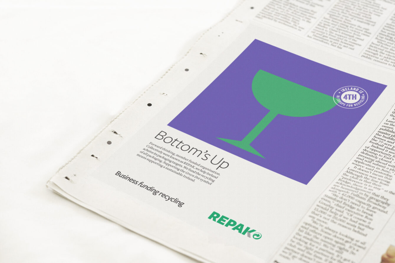
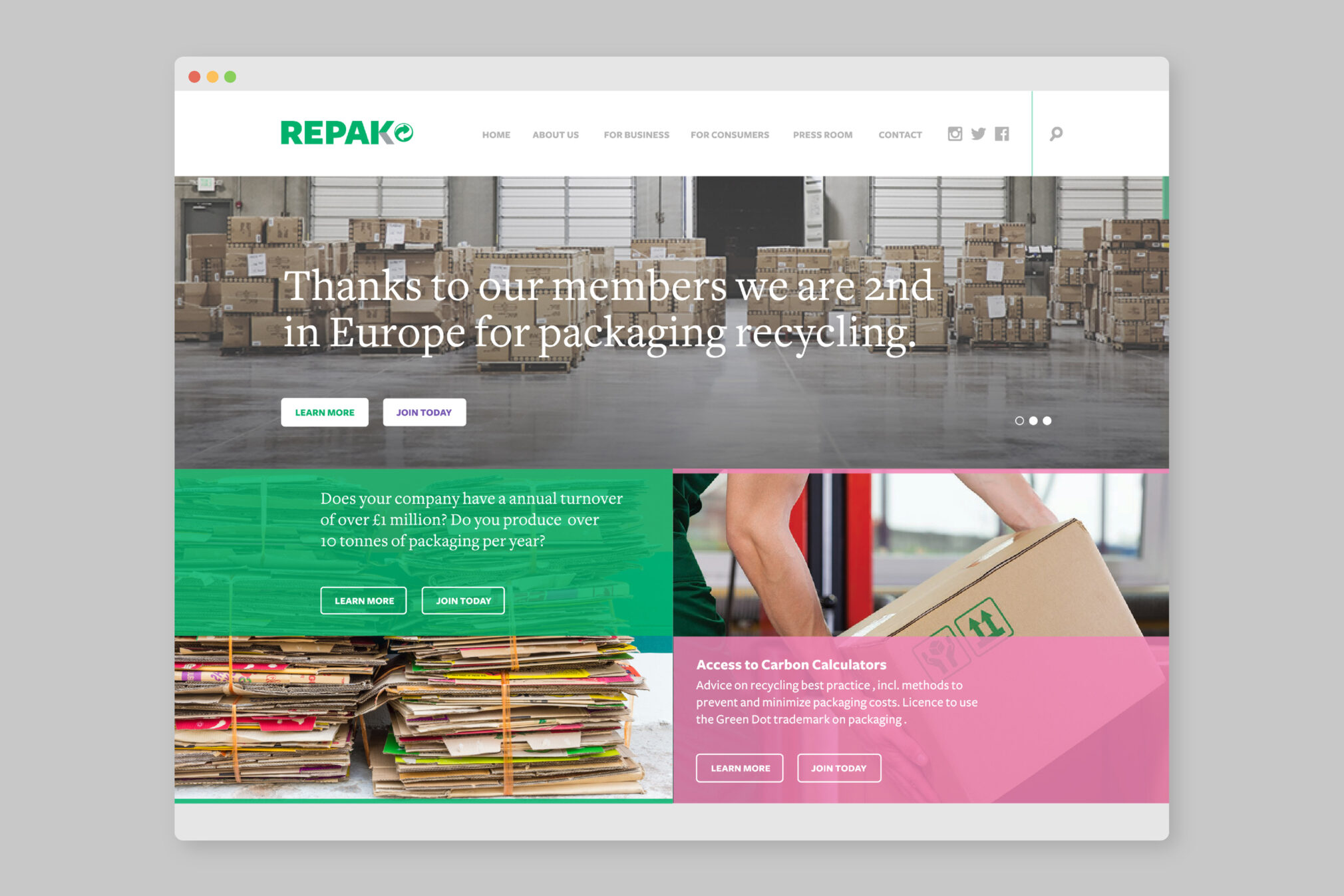
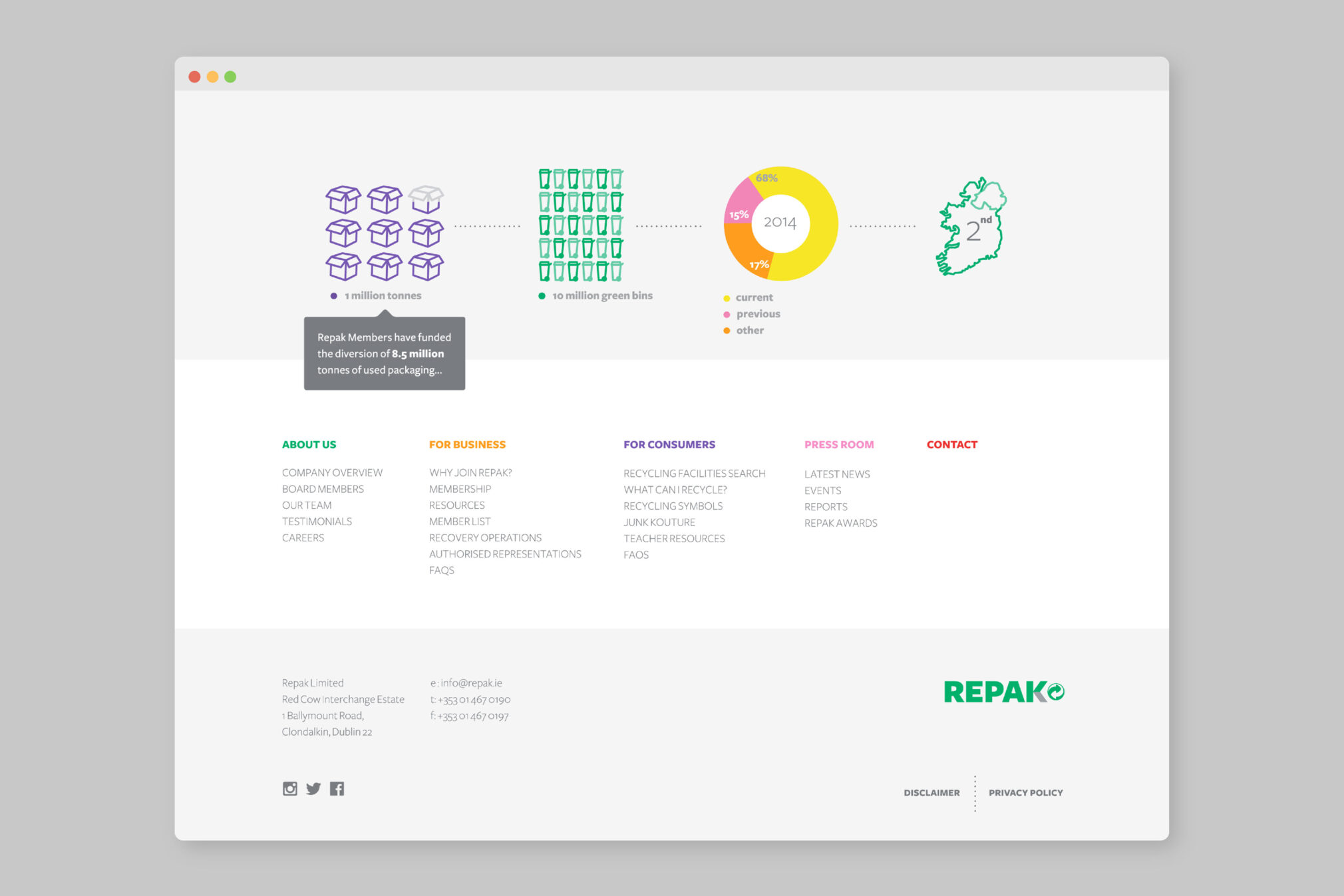
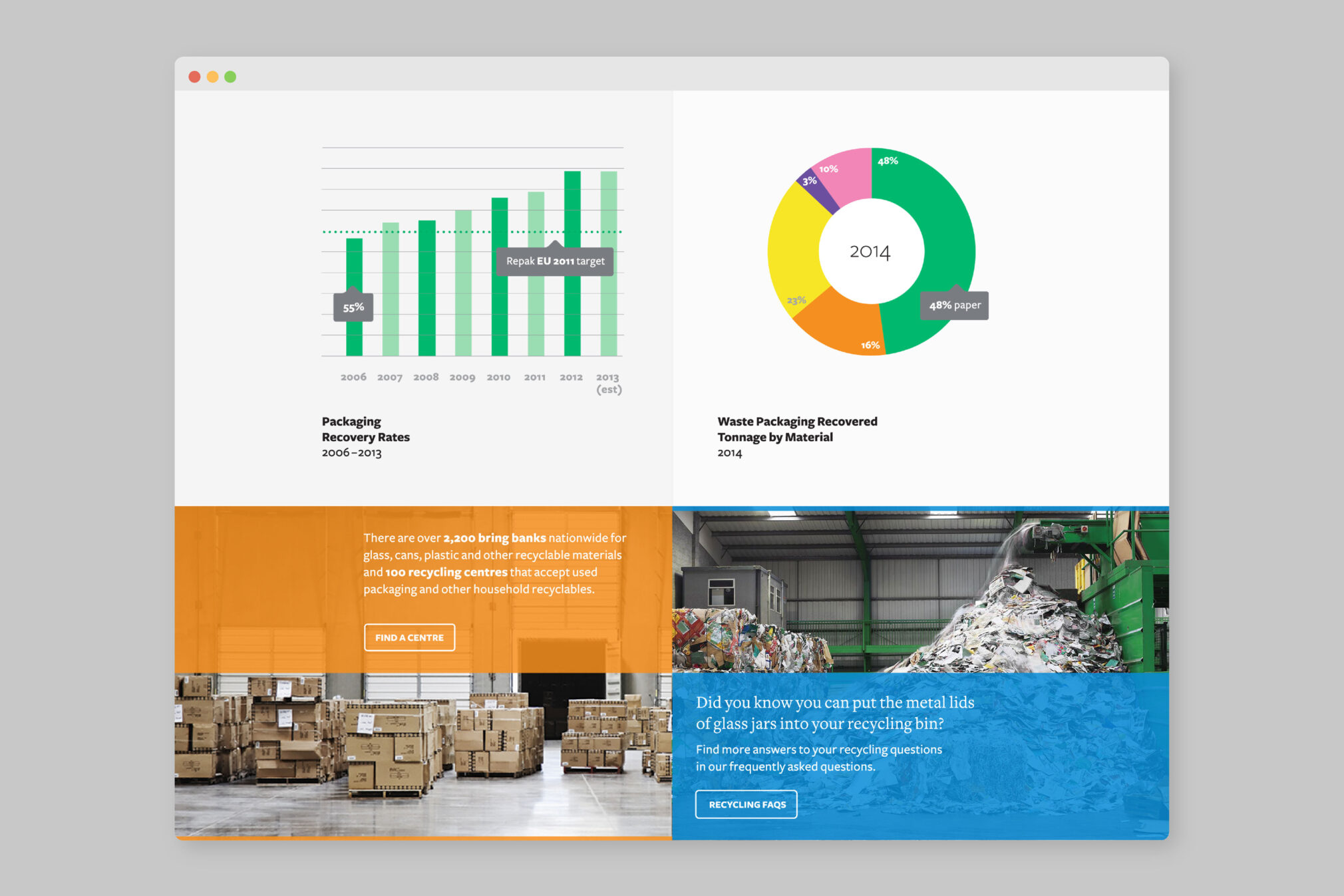
Repak is a not for profit organisation for Irish businesses, owned by its members. Repak operates a compliance scheme for packaging recovery, in line with environmental targets for Ireland. Following a strategic review of the brand, we created a new visual identity across all collateral from print to interiors. The new brand identity reflects a vibrant organisation with a clear sense of purpose.
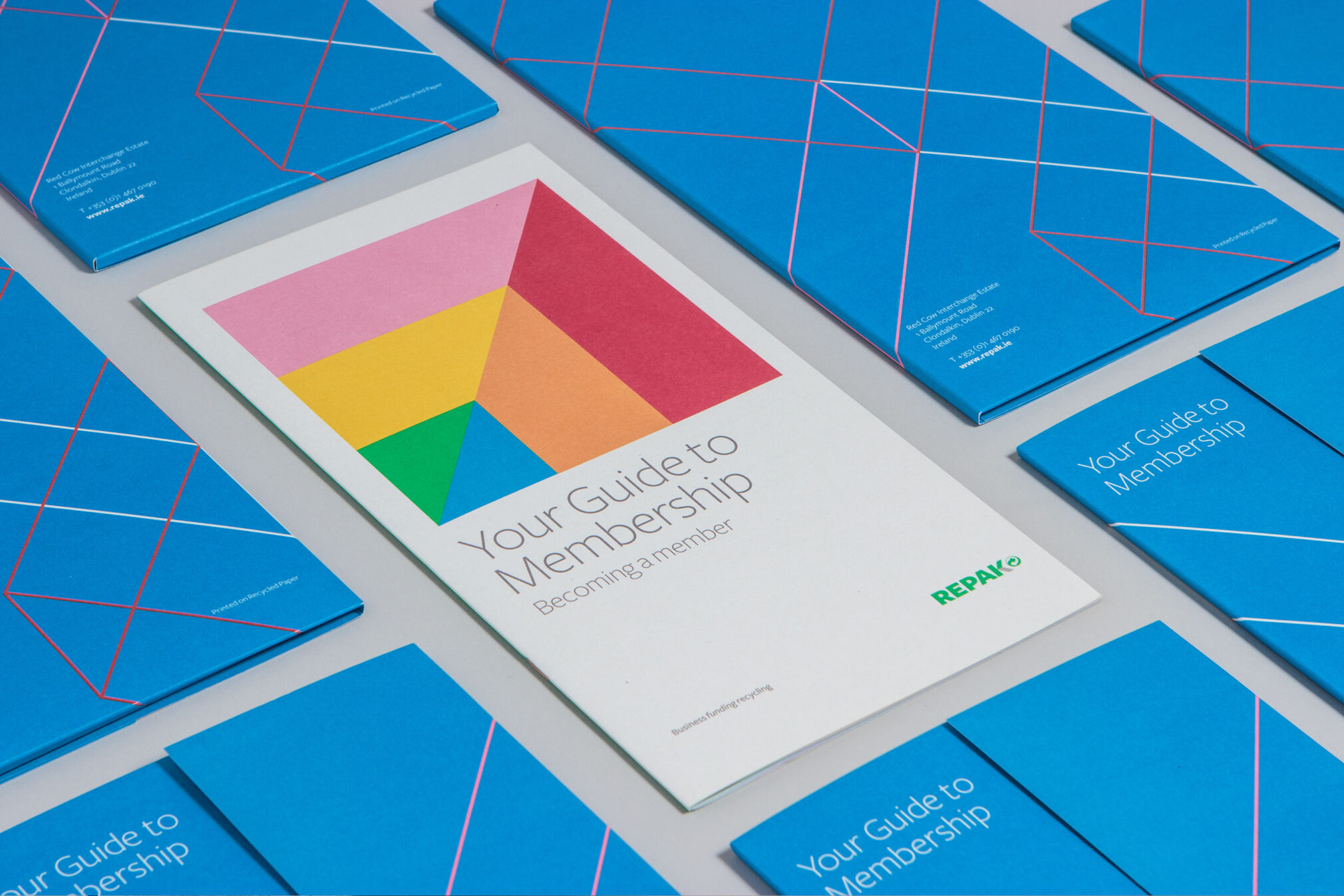
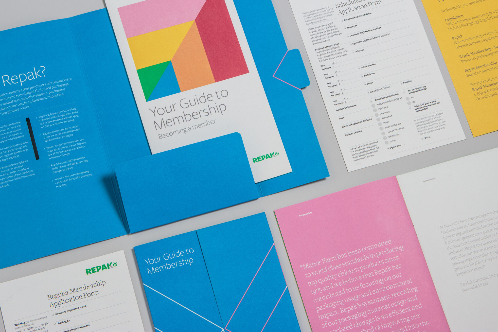
The use of the chevron in the logo hints at the dimensions of a box - the most basic packaging element and also an arrow, representing purpose, process, and progress. This shape has evolved with the brand, and is flexible in its use, creating visual engagement and meaning.

The brand is confident and strong, yet approachable in tone, through language that taps into the collective and the use of bright colours. The palette was developed to reflect a bright future and to avoid the exclusive use of green, which is over-used in this space.
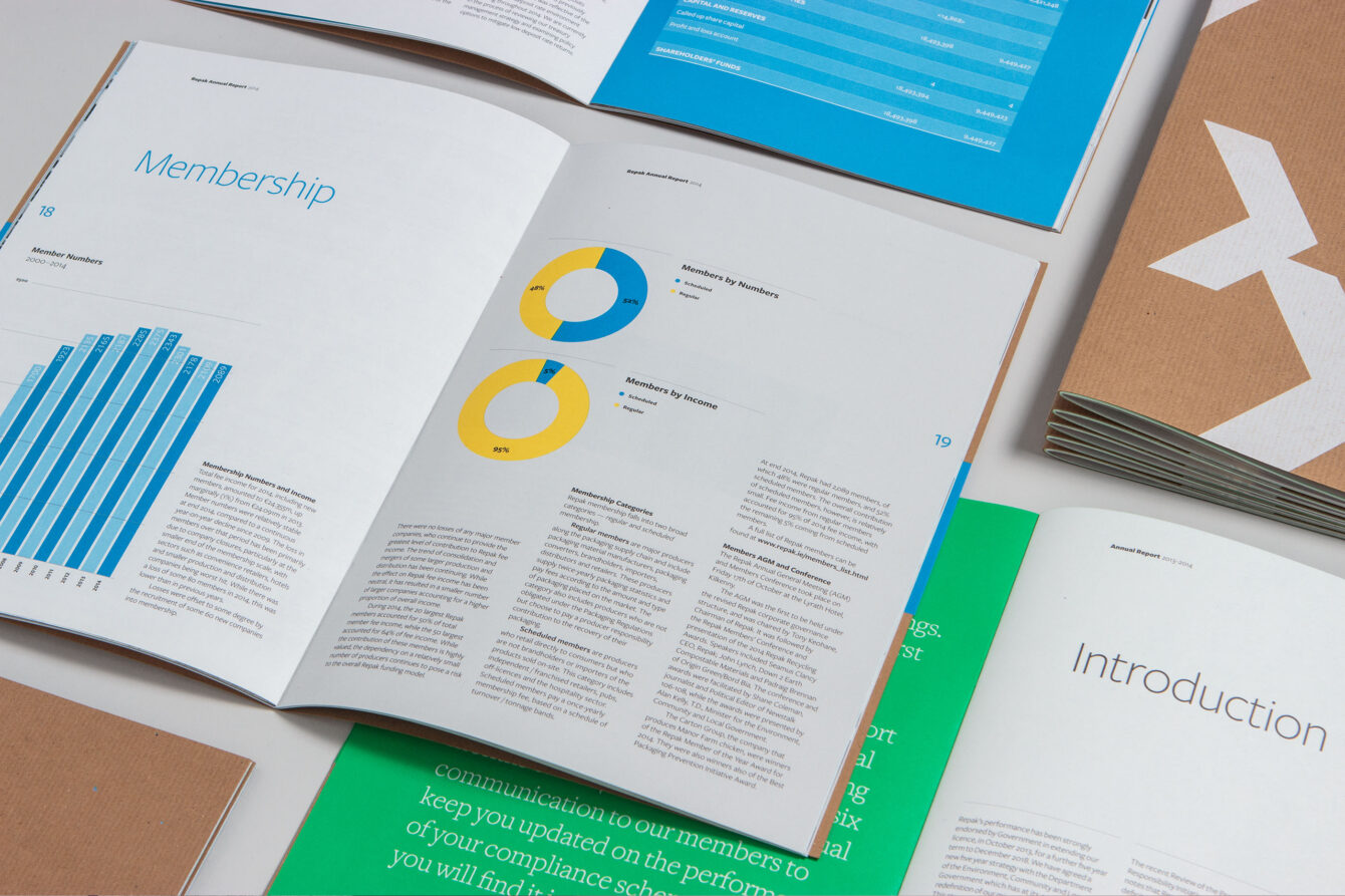
Icons from packaging are used to help deliver key messages while a flexible and extensive type family collection is chosen, designed to handle standard text sizes for large and small quantities of copy. Unique enough to create impact and standout while also complying with legibility standards.
Materials used in brochureware and in the design of its internal space, support the ethos of Repak. The range of assets within the identity and their application use, along with an interchangeable bold palette results in a fresh and dynamic brand, that has evolved over the years without growing tired.
Ireland's child & family agency
Public & NGO
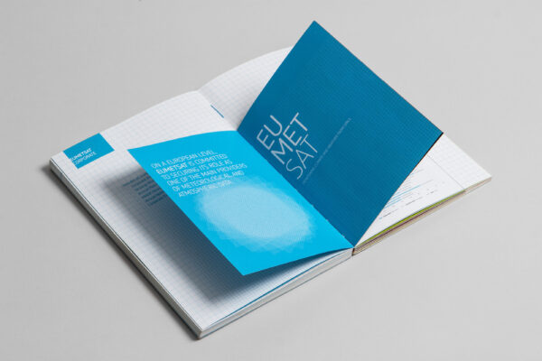
Guidelines for Europe's Satellite Agency
Corporate Services + Public & NGO
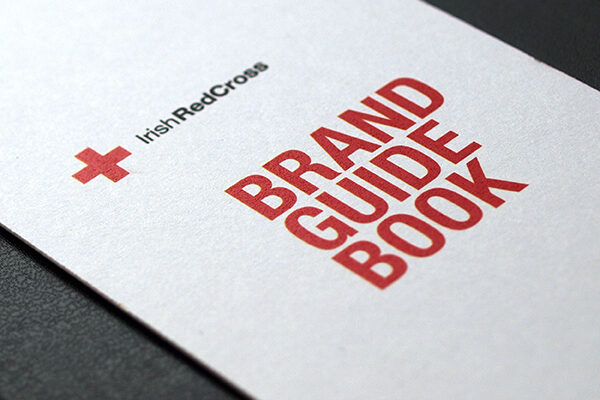
Brand Identity Guidelines
Public & NGO
A contemporary take on corporate finance
Corporate Services

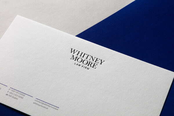
People friendly law firm
Corporate Services
The world's largest CTA investment manager
Corporate Services