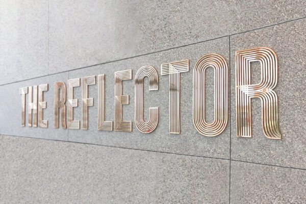
The Reflector
An iconic building in Dublin's silicon docks
Property
Property
Property
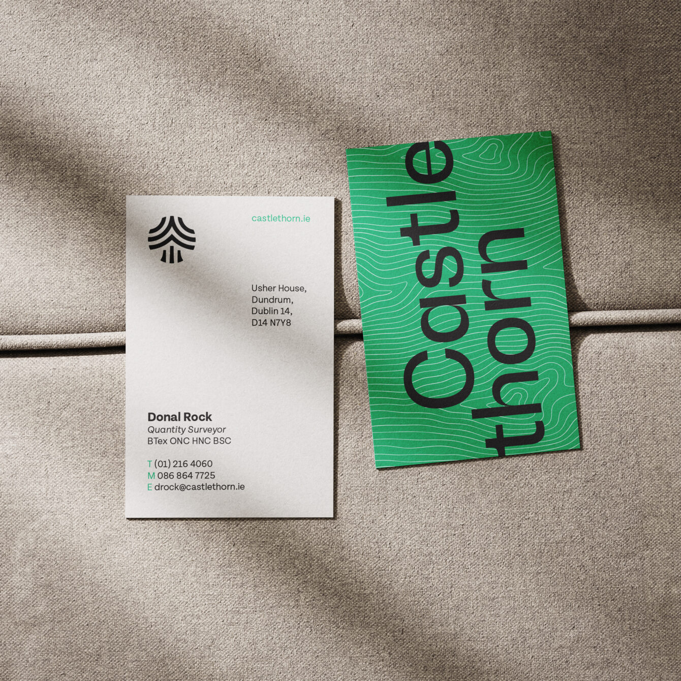
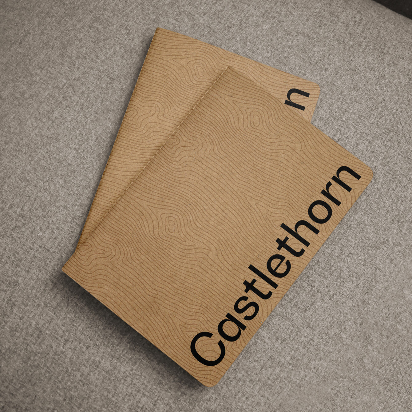
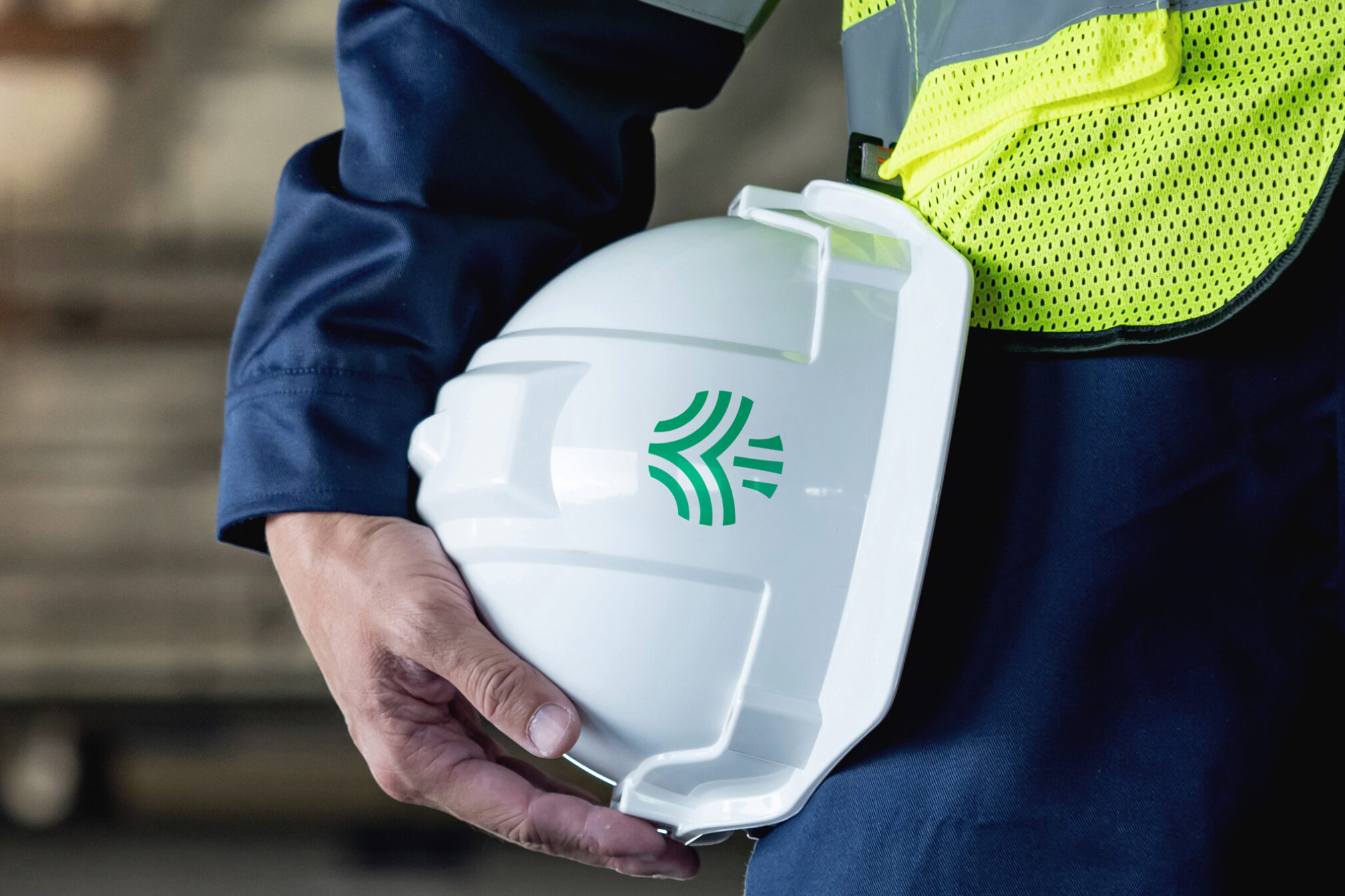
Having successfully rebranded Castlethorn, one of Ireland’s most successful property developers in 2011, CI Studio was commissioned to consolidate both the existing Castlethorn brand and its commercial arm, Chartered Land, under one new entity. Keeping the Castlethorn Green, we revised the logotype and introduced a new symbol which is a graphic interpretation of their very first oak tree motif combined with the existing Chartered Land emblem.
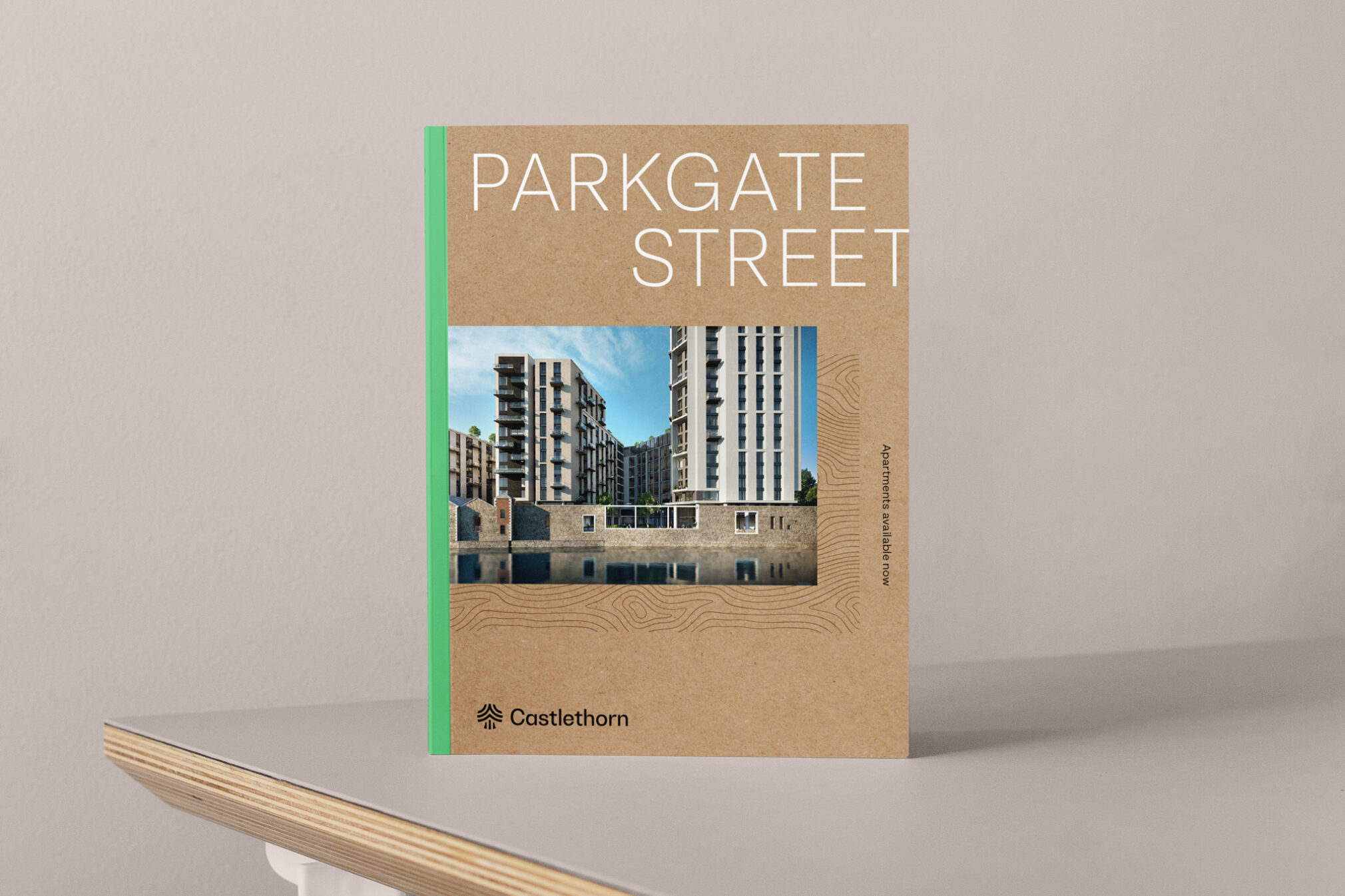
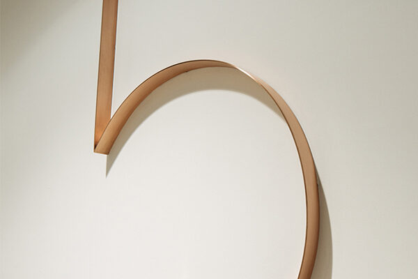
The natural patterns of wood, an element which is present in the previous identity and in all of the Castlethorn development landscaping, is used throughout to create a distinctive visual language which emphasizes the exceptional quality and craftsmanship that sets castlethorn apart from other commercial developers.
Illustrations were developed in-house to work with the identity, helping convey specific messages along with the Castlethorn Home stamp of quality. We worked with photographer Al Higgins on capturing the craft of the building works and the company's attention to detail when it comes to fittings and materials.
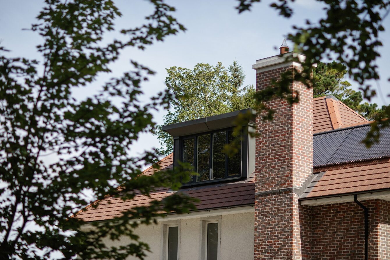


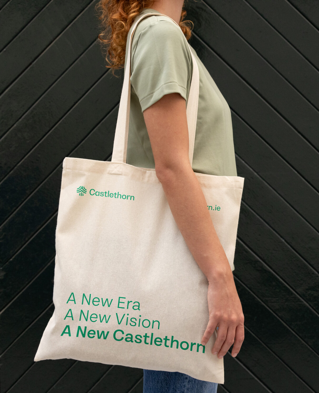
A New Era, A New Vision, A New Castlethorn, served to herald this new consolidation between the commercial and residential parts of the business. From planning and design, through to build and after-service, the brand's over-arching ethos of creating exceptional communities still remains as strong as ever.
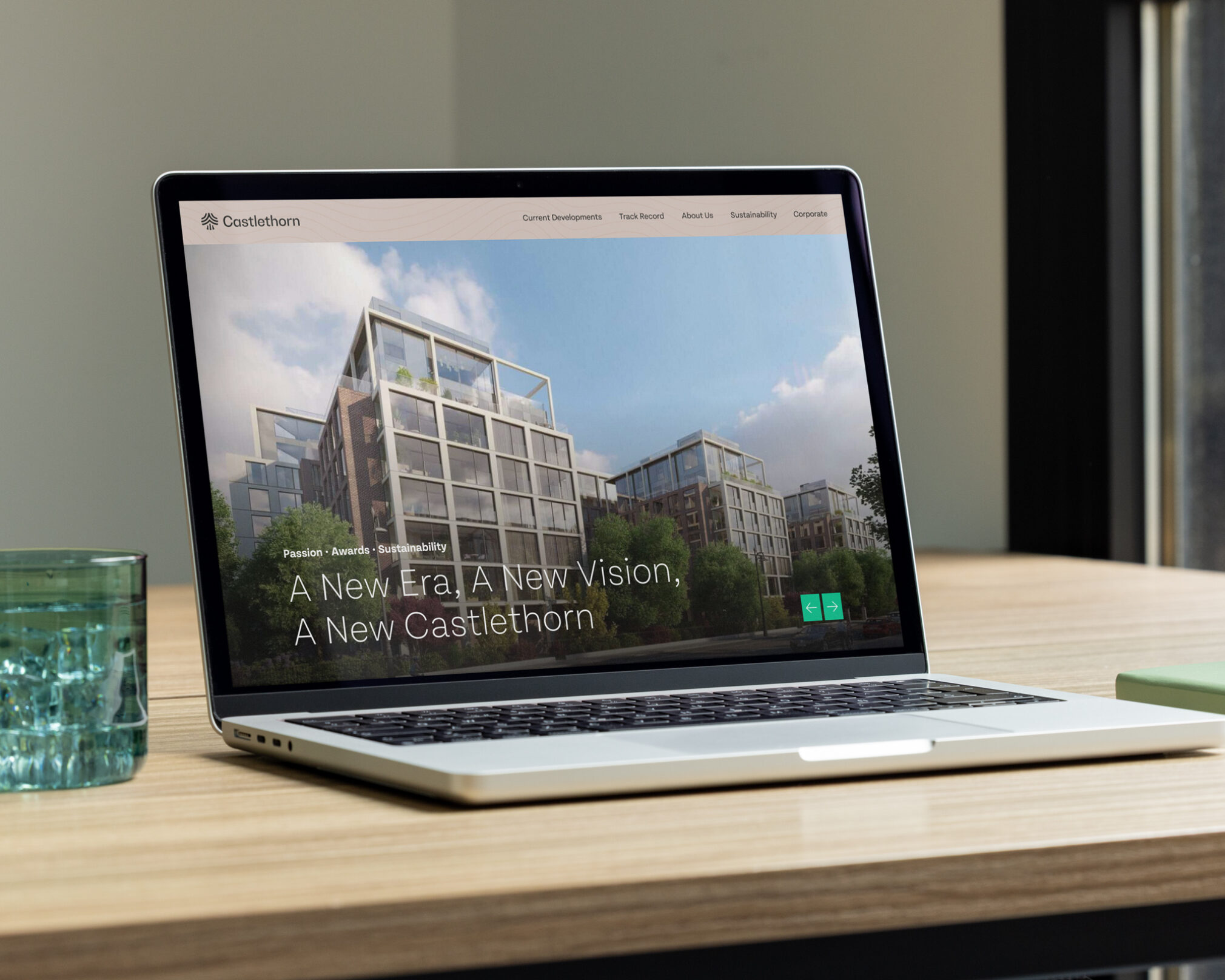
The brand identity is carried throughout all touch points from print to digital and environmental including hoarding, social media, press campaigns and website.


An iconic building in Dublin's silicon docks
Property
Behind every door lies a Dwelling.
Property
Dublin's creative district
Property
Signage & Wayfinding
Property
A new vision for an iconic brand
Property
The future of builds
Property + Tech


